
Q1. In what ways does your media product use, develop or challenge forms and conventions of real media products?
For my part of my primary research, I analysed pop music videos, along with magazine adverts for pop albums and pop digipaks themselves. This genre was the closest to my song so I could therefore discover the relevant codes and conventions that I needed to include in my own music video production. It was key that I discover particularly how this genre is constructed in terms of representations of characters/audiences, ideologies, target audience, how institutions are included/represented, which narrative and representation theories are included and how realistic pop videos tend to be and finally how split narratives are used.
Main Product Analysis
(How Used In Existing Products)
Conventions:
 Props: Two significant props in P!nk’s music video for her song ‘Just Give me a
Reason’ are the two old style microphones used by P!nk and Nate. These are
significant to the pop genre as some sort of musical instrument or device is
used in the split narratives of pop videos.
Props: Two significant props in P!nk’s music video for her song ‘Just Give me a
Reason’ are the two old style microphones used by P!nk and Nate. These are
significant to the pop genre as some sort of musical instrument or device is
used in the split narratives of pop videos.
 Similarly throughout the whole video of ‘I Won’t Give Up’ the director regularly
returns to Jason singing and playing his guitar. This is again essential as it
creates a split narrative and I feel that the physical use of the guitar helps
to keep the video more realistic and also helps to show the emotion in the way
that Jason plays it as the song builds up.
Similarly throughout the whole video of ‘I Won’t Give Up’ the director regularly
returns to Jason singing and playing his guitar. This is again essential as it
creates a split narrative and I feel that the physical use of the guitar helps
to keep the video more realistic and also helps to show the emotion in the way
that Jason plays it as the song builds up.
Another significant prop in this music video is the large bear on the
mattress with light up eyes. This could represent P!nk's inner child and her
vulnerability as she seeks comfort from a cuddly toy. This could also relate to her social group as I am sure many will be young teens to young adult ages who will no doubt remember or still take comfort from their favourite childhood toys.
The props used in Katy Perry’s video ‘Firework’ are not relative to the
pop genre but they are extremely relevant to the narrative, as they depict each
characters personality.
_________________________________________________________________________________________

Costume: Many of the characters in ‘I Won’t Give Up’ are wearing slightly dirty and bedraggled clothes. This helps to portray the idea of the presence of struggles and hardships within life and how it affects everyone, and consequently the ideology the song not to give up when we see all these bedraggled people become happy at the end, showing how they did not give up despite their state. Likewise many of the costumes in Katy Perry’s music video are relatively all significant in simply depicting their character social group in society and in the video.
_________________________________________________________________________________________
 Setting: The settings in the video are mostly made up of secluded places,
including a forest and a desert. The fact that the director has chosen these
settings is significant as it portrays the loneliness felt by all the
characters when they face their problems. These obscure settings could also help to show disequilibrium, that Todorov states to be apparent in every media text, as under no normal circumstances or state of equilibrium would we see these ordinary people stand in the middle of a desert or spooky forest.
Setting: The settings in the video are mostly made up of secluded places,
including a forest and a desert. The fact that the director has chosen these
settings is significant as it portrays the loneliness felt by all the
characters when they face their problems. These obscure settings could also help to show disequilibrium, that Todorov states to be apparent in every media text, as under no normal circumstances or state of equilibrium would we see these ordinary people stand in the middle of a desert or spooky forest.  The main setting is the 'dream world' in P!nk’s video, the use of smoke
as perhaps clouds, is a clear indication of this. It is evident that P!nk is
trapped in this world as there is no ground to walk on. This effective in
conveying the idea of isolation.
The main setting is the 'dream world' in P!nk’s video, the use of smoke
as perhaps clouds, is a clear indication of this. It is evident that P!nk is
trapped in this world as there is no ground to walk on. This effective in
conveying the idea of isolation. Interestingly in ‘Firework’ the audience is mainly presented with
everyday settings including a house, hospital, nightclub and a pool party. This
indicates the normality of the characters and is used to highlight their
problems. For example, the girl who is conscious about her body is at a pool
party, where obviously she would be expected to wear swimwear. Similarly, the
boy who is tormented by his parents arguing is placed in his home, where the
majority of arguments happen - out of sight from the wider world.
Interestingly in ‘Firework’ the audience is mainly presented with
everyday settings including a house, hospital, nightclub and a pool party. This
indicates the normality of the characters and is used to highlight their
problems. For example, the girl who is conscious about her body is at a pool
party, where obviously she would be expected to wear swimwear. Similarly, the
boy who is tormented by his parents arguing is placed in his home, where the
majority of arguments happen - out of sight from the wider world.

Stock Characters: Very much like the settings in ‘Firework’, due to the split narrative idea the characters used are perceived to be normal people including a young person with cancer, a girl who self-conscious about her weight and a teenage boy among others. By using 'normal' people, the audience can relate better to the song and can appreciate the ideology more, that everyone is special and that they have the potential to take control on the 'demons' in their life and overcome their fears. This can be very important for pop videos as they want to appeal to the wider audience. As a range of social groups are represented too, we can expect her target market to be quite varied.
All three music videos I analysed featured the artist as a stock
character too. This helps the audience to recognise who the video belongs to
and is essential in the marketing of this product as they act as a constant figure. Propp's narrative theory states there are certain types of characters in each media. Katy Perry's music video, she would act as the donor, spreading the ideology out, whilst the song could act as a father figure to the people within the song as it provides guidance within the lyrics. The main characters themselves would be the heroes - the people searching for something.
_________________________________________________________________________________________
 Stock Events: Stock events can be difficult to establish in music videos as each one
is very different and relates specifically to the lyrics and ideology of the
song. However, a good example of how events are used is the split narrative
which dominates the entirety of Katy’s music video. The everyday events of
birth and parties again help the audience to realise their potential to have an
impact on their everyday lives. It also shows as part of the song's ideology that everything you do, no matter
how futile it may seem at the time, can be important. A good representation of this is
when the teenage boy attempts to stop his parents fighting. It is likely he
might have done this out of impulse with little hope that it would have an
effect but through trying, he comes out of his shell and stands up for his
Mother, which almost releases him in a sense, to do the same thing next time
his parents argue. Focusing of Todorov's narrative theory this stock event starts with the disequilibrium and the boy breaking up the fight shows the beginning's of the new equilibrium as he starts to try and fix things by stopping the fighting.
Stock Events: Stock events can be difficult to establish in music videos as each one
is very different and relates specifically to the lyrics and ideology of the
song. However, a good example of how events are used is the split narrative
which dominates the entirety of Katy’s music video. The everyday events of
birth and parties again help the audience to realise their potential to have an
impact on their everyday lives. It also shows as part of the song's ideology that everything you do, no matter
how futile it may seem at the time, can be important. A good representation of this is
when the teenage boy attempts to stop his parents fighting. It is likely he
might have done this out of impulse with little hope that it would have an
effect but through trying, he comes out of his shell and stands up for his
Mother, which almost releases him in a sense, to do the same thing next time
his parents argue. Focusing of Todorov's narrative theory this stock event starts with the disequilibrium and the boy breaking up the fight shows the beginning's of the new equilibrium as he starts to try and fix things by stopping the fighting. _________________________________________________________________________________________
Narrative & Representation Theory: This is shown very well in Jason Mraz’s music video. To a certain extent
there is an element of the Constructionist Theory within it.
This is because in general the audience must make up their own mind as to what
the video means to them, and what everyone's problems are that they must
overcome. In addition, I believe the Reflective Theory of Representation is
present within this music video as it is evident that the director wants to
show his views on giving up on your problems and wants to portray the ideology
of no-one should ever give up. The Enigma Code in P!nk's song would be that the audience are intrigued to know which man she will choose at the end of the song and video. Using Firework as an example for Action Code as well as Enigma Code, the audience first sees a young boy cuddling his younger sister. They then question why he is doing this (Enigma Code). The next shot shows their parents fighting in the other room which is the Action Code as it provides the audience with the answer to their question.
As a general rule, in terms of Propp's Narrative Theory, for all the music videos I analysed, the song acts as the father figure, providing guidance not only for the characters in the video but the audience too. The hero or heroes are the characters who are searching for their happy ending. The singer is often the donor or helper, aiding them to find what they are looking for through the singing of the song. The villain, is their problems or insecurities, whilst the princess is what they gained at the end of the video/song.
_________________________________________________________________________________________
_________________________________________________________________________________________
Codes:
 Camera Angle: A variety of camera angles are used in P!nk’s music video. In general,
the shots of P!nk and Nate singing to the camera are head on shots, neither
high angle or low angle. The main reason for this would be to represent equality amongst the two, and to not show a bias or a binary opposition (Levi Strauss Narrative Theory) between both sides of the story.
Camera Angle: A variety of camera angles are used in P!nk’s music video. In general,
the shots of P!nk and Nate singing to the camera are head on shots, neither
high angle or low angle. The main reason for this would be to represent equality amongst the two, and to not show a bias or a binary opposition (Levi Strauss Narrative Theory) between both sides of the story. A lot of panning shots are used, starting off with one at the beginning
panning from P!nk's legs to her face. Again, there is no angle to this just a
straight on shot, starting the video off with an unbiased representation towards the two stock characters.
Other panning shots are used mainly in the 'dream world' panning from the bed
to the TV and back mostly. This is effective in that it makes the setting seem
larger and more complicated and overall makes the music video more interesting
for the audience, opposed to using still shots throughout.
A lot of panning shots are used, starting off with one at the beginning
panning from P!nk's legs to her face. Again, there is no angle to this just a
straight on shot, starting the video off with an unbiased representation towards the two stock characters.
Other panning shots are used mainly in the 'dream world' panning from the bed
to the TV and back mostly. This is effective in that it makes the setting seem
larger and more complicated and overall makes the music video more interesting
for the audience, opposed to using still shots throughout.
_________________________________________________________________________________________


Camera Range: Focusing on ‘Firework’ for this code there are many relevant factors to point out. Through the use of close-up shots the audience can see the emotion in everyone's faces which helps to engage them in each narrative. The establishing shots also use camera range to create a very effective opening sequence. The first shot is an extreme long shot and following that each shot becomes more zoomed in and focuses on smaller detail. By the end of the opening sequence the camera has focused in on Katy Perry who is standing no top of one of the many buildings in the city. This could symbolise how its the people who make the city what it is and therefore how it is the inside of a person that counts and the personality opposed to the overview and the first impressions. It is also important to note here that Katy Perry is the first character see in this video.
When the fireworks are introduced to each person a mid shot is generally
used so you can see the effect on the person, but also long shots are regularly
used to show the amount of people who are confident and who are alive with this
firework.
_________________________________________________________________________________________


Composition: In Jason Mraz’s video the composition of many of the shots here are in line with the rule of thirds, suggesting that the audience prefer to look at something that is not in the dead centre of the shot. We see this used effectively many times through the four and a half minute video. Looking at Katy Perry's parts in her video, when she sings into the camera she also abides by the rule of thirds. It is important for pop music videos that during parts of the video when the singers are singing to the camera that this rule is taken into account. Levi Strauss's Binary opposition could be applied here as we see Katy Perry placed on both sides of the shot when abiding by the rule of thirds. This shows the binary oppositions as in fact she is shown to be on everyone's side no matter what their story.
_________________________________________________________________________________________

Editing: Throughout ‘I Won’t Give Up’ there is a mixture of jump cuts and fades between each shot. The fading helps to link all the characters together through their problems and helps to keep the tone solemn. Also, at many points in the song the shots go in and out of focus, this is also very effective as it conveys the idea of not being able to see the end of your troubles. It also adds to the flow of the video nicely. As this is a relatively slow pop song, the editing is slower than that of the other two songs and this is extremely important in terms of the mood of the song. It would be quite inappropriate to use quick editing here.
 POV: The use of POV is very effective in 'Firework'. Each time it is used the
audience can see the challenge that each character faces. This is important, in
that the audience does not therefore have to make up their own mind what might
be their specific hurdle to jump.
POV: The use of POV is very effective in 'Firework'. Each time it is used the
audience can see the challenge that each character faces. This is important, in
that the audience does not therefore have to make up their own mind what might
be their specific hurdle to jump._________________________________________________________________________________________

Lighting: The lighting pays a big part in Katy Perry’s music video. The majority of the scenes are fairly dark; these are then lighted up by the fireworks. This shows how everyone plays a role in making the world what it is and how important the individual is in some situations.

The lighting throughout the whole of ‘Just Give Me a Reason’ is also very
effective. One of the significant differences between the smoky 'dream world'
and the water 'dream world' is the change in lighting. The reason the water
'dream world' appears more sinister is the darkness, this suggests the other
side of her dream. This is a binary opposition according to Levi Strauss's Narrative Theory, as the two are direct contrasts of each other.
_________________________________________________________________________________________
 Mis-en-scene: The use of fireworks is extremely significant in this music video.
Without them the whole ideology would not be presented as well. Most people
associate fireworks with celebration and happiness. Therefore, as they
symbolise a new found confidence in each person, a starting point for them to
grow as a person. Perhaps one of the most significant points this is used is
the scene where the baby is born. The firework there represents the new life,
the potential and the uniqueness of this baby who is only just entering this
world and has the ability to do anything.
Mis-en-scene: The use of fireworks is extremely significant in this music video.
Without them the whole ideology would not be presented as well. Most people
associate fireworks with celebration and happiness. Therefore, as they
symbolise a new found confidence in each person, a starting point for them to
grow as a person. Perhaps one of the most significant points this is used is
the scene where the baby is born. The firework there represents the new life,
the potential and the uniqueness of this baby who is only just entering this
world and has the ability to do anything. In P!nk’s video there is not much in the way of mis-en-scene but two
significant things that add to the meaning of the video are the use of the moon
and stars. This indicates that it is night time which supports the idea that
this is all a dream or a 'bad dream' as suggested in the lyrics.
In P!nk’s video there is not much in the way of mis-en-scene but two
significant things that add to the meaning of the video are the use of the moon
and stars. This indicates that it is night time which supports the idea that
this is all a dream or a 'bad dream' as suggested in the lyrics.
_________________________________________________________________________________________
Ideology: Each individual song has a different ideology which is portrayed but
each code and convention. For Jason’s song one can guess from the title of the song
that the ideology is to never give up no matter what you have to overcome. This
video is great for motivating people to carry on specifically because most
people's problems will not be as life changing as some of the characters in the
video. That being said it shows how no problem is petty in anyway, which is
shown through the young boy's fear of water being shown on the same level as
the man who has lost his leg.
2nd Artefact Analysis (How Used In Existing Products)
Conventions:
Images:
 - Stock Character: Naturally, by using Jessie J herself, before the reader has even read the text, they instantly know who and what this advert is about. The Male Gaze theory states that women are often shown in full body, to attract a male’s attention. However, here a close up shot is used simply of Jessie J's face. This makes the advert more powerful as her demeaning expression and face in general really stands out from the page. Despite this, her perfect complexion and general attractiveness will play a part in attracting a male audience. When this advert was used, Jessie J was known for her jet black hairstyle so this it was important that the photographer and designer both made this a central point of the photo and the finished advert, to help represent her as an artist and attract her target audience. Her determined face, could also help to represent her as a helper/donor according to Propp's Narrative theory as she engages with the audience.
 -Logos: With reference to Evanescence’s advert, the two record label logos are in both the bottom corners, so it is likely that the reader will view them last and as it has been said that one's memory best remembers items placed first and last this could be a good decision.
 Album Cover: Much like using a motif having the album cover on an advert helps it become instantly recognisable when it is hidden amongst others perhaps in a CD store or even on ITunes.
 Lighting: The lighting of the images is very important. On the Paramore advert the light bounces nicely off Hayley’s face highlighting her features and her seemingly perfect complexion. The absence of shadows in the picture is very stylistic and makes the image appear more professional. On the flash images and album cover there is a slight shadow placed around some of the edges giving them a slight 3D affect which makes the advert more interesting for the audience.

Setting: The image of Jessie J is simply placed on a white background. By not having her in a noticeable setting the audience is once again forced to only notice the important information provided by the minimal text used.
The setting of the main image used for Evanescence's advert is somewhat surreal, as the audience would not come across this setting in everyday life. The large door that reveals the dark sky outside is another indication of the style of music that this advert is promoting.

Costume: Jessie's black costume and gold earrings are important as they keep in the theme of the advert. The lace style of her top makes her more attractive to males and her gold earrings make her also desirable. By making her wear this outfit her clean cut style of pop music is presented well, whereas if she has been wearing a tracksuit I feel the audience would be expecting a different style of music.

_________________________________________________________________________________________
Representation: There are three identifiable representations in the Paramore advert; the band, album and the target audience.
 -The Band: Their personalities portrayed by their costume, by placing
the band on the advert it also suggests their want to have a close relationship
with their audience as they make themselves easily identifiable.
-The Band: Their personalities portrayed by their costume, by placing
the band on the advert it also suggests their want to have a close relationship
with their audience as they make themselves easily identifiable.
_________________________________________________________________________________________
Codes:
Text:
 Main Text: The magazine advert for Evanescence’s
album uses the absolute minimum in terms of text. One element that is different
is that this is an advert for an album that is yet to be released. This means
that it is
Main Text: The magazine advert for Evanescence’s
album uses the absolute minimum in terms of text. One element that is different
is that this is an advert for an album that is yet to be released. This means
that it is
 Website Address: The inclusion of Jessie's website on her advert gives the audience
another median that they can explore to find out any other information about
the artist or album, this is essential in that not much information is used on
adverts and should the audience have any questions they need somewhere to look
for the answers. It is also important as the internet is a big part of many
people's lives (specifically her target audience of young people) these days that Jessie J is associated with it, so they can quickly look her up on their phones, laptops, tablets or IPods, not matter where they are.
Website Address: The inclusion of Jessie's website on her advert gives the audience
another median that they can explore to find out any other information about
the artist or album, this is essential in that not much information is used on
adverts and should the audience have any questions they need somewhere to look
for the answers. It is also important as the internet is a big part of many
people's lives (specifically her target audience of young people) these days that Jessie J is associated with it, so they can quickly look her up on their phones, laptops, tablets or IPods, not matter where they are.
_________________________________________________________________________________________
Layout:
 -General Layout: Unlike some magazine
adverts ‘Brand New Eyes’ is rather busy yet still effective. The style used is
of a wooden notice board. This could perhaps appeal to a younger and older
reader as both will have used or at least experience getting information from
one. It even almost resembles a scrap book, which has the connotations of good
memories so once again this is an indication to the reader that taking the time
to look at it and buy the album will be worthwhile. The use of sellotape to in
effect hold the different bits on the board gives it a quirky and interesting
look, mainly used to please the eye of the reader. Unlike the 'Brand New Eyes'
advert the layout of Jessie’s advert is very simple. Being split into two
halves means the reader's attention is captured by the picture then they can
simply follow the natural line down to read the information.
-General Layout: Unlike some magazine
adverts ‘Brand New Eyes’ is rather busy yet still effective. The style used is
of a wooden notice board. This could perhaps appeal to a younger and older
reader as both will have used or at least experience getting information from
one. It even almost resembles a scrap book, which has the connotations of good
memories so once again this is an indication to the reader that taking the time
to look at it and buy the album will be worthwhile. The use of sellotape to in
effect hold the different bits on the board gives it a quirky and interesting
look, mainly used to please the eye of the reader. Unlike the 'Brand New Eyes'
advert the layout of Jessie’s advert is very simple. Being split into two
halves means the reader's attention is captured by the picture then they can
simply follow the natural line down to read the information. -Information Layout: Also, all the important
information is in the column middle of the advert which means the reader has to
make minimal effort in order to take in all the information, this is vital for
a magazine advert as it is unlikely the reader will be willing to spend a lot
of time looking at the page.
-Information Layout: Also, all the important
information is in the column middle of the advert which means the reader has to
make minimal effort in order to take in all the information, this is vital for
a magazine advert as it is unlikely the reader will be willing to spend a lot
of time looking at the page.
 Looking
at Paramore’s advert the image composition is more complicated due to there
being more members of the band. By placing Hayley, the main singer, further
forward than the other members she is notably easier to recognise and identify.
This is important to attract their regular fan base as she is without a doubt
the most well-known member of the band. Male Gaze Theory is also present here
as placing the only female of the group at the front would attract the male
audience that would perhaps not otherwise be interested.
Looking
at Paramore’s advert the image composition is more complicated due to there
being more members of the band. By placing Hayley, the main singer, further
forward than the other members she is notably easier to recognise and identify.
This is important to attract their regular fan base as she is without a doubt
the most well-known member of the band. Male Gaze Theory is also present here
as placing the only female of the group at the front would attract the male
audience that would perhaps not otherwise be interested.
_________________________________________________________________________________________
Colour:
 -Main body: The colour scheme used in the Evanescence magazine advert is
very limited. It is mainly black, white and gold used. This largely dark style
reflects perhaps the type of music normally made by Evanescence, but at the
same time it fits in well with the setting of the image. Much like the Jessie J
advert the gold suggests luxury music.
-Main body: The colour scheme used in the Evanescence magazine advert is
very limited. It is mainly black, white and gold used. This largely dark style
reflects perhaps the type of music normally made by Evanescence, but at the
same time it fits in well with the setting of the image. Much like the Jessie J
advert the gold suggests luxury music.  The ‘Who You Are’ advert is very clever in its use of colour as there
are actually only three colours used; black, white and gold. In conjunction,
with Jessie's hair her lipstick, clothes, eye make-up and nails are all black.
This makes her really stand out from the advert as her appearance is very
distinctive and recognisable to the reader. Due to Jessie being dressed almost
completely in black the white background is what makes her stand out even more.
On the contrary the white writing stands out from the black background. The
gold nicely stands out from the black and as gold is normally linked to the
idea of money and success there is a hint that this album is very good and
successful.
The ‘Who You Are’ advert is very clever in its use of colour as there
are actually only three colours used; black, white and gold. In conjunction,
with Jessie's hair her lipstick, clothes, eye make-up and nails are all black.
This makes her really stand out from the advert as her appearance is very
distinctive and recognisable to the reader. Due to Jessie being dressed almost
completely in black the white background is what makes her stand out even more.
On the contrary the white writing stands out from the black background. The
gold nicely stands out from the black and as gold is normally linked to the
idea of money and success there is a hint that this album is very good and
successful.
 -Logo: The 'Virgin Megastores' logo stands out profoundly on this advert.
By not conforming to the rather dull colour scheme, the logo although rather
small catches the reader’s eye and is instantly recognisable as one of the
Virgin brands.
-Logo: The 'Virgin Megastores' logo stands out profoundly on this advert.
By not conforming to the rather dull colour scheme, the logo although rather
small catches the reader’s eye and is instantly recognisable as one of the
Virgin brands.
Whilst Katy Perry’s is perfectly summed up by the line 'you're original,
cannot be replaced'. The aim is to make people realised that they are special;
there is no need to be ashamed of whom they are and that they have the power
inside of them to do whatever they like.
Finally, the ideology of Pink’s song is that the breakdown of a
relationship is never the fault of just one person. Both will have made
mistakes that contributed to it and if it was fate for them to break up then it
would happen eventually whether they try to fix it or not.
_________________________________________________________________________________________
2nd Artefact Analysis (How Used In Existing Products)
Conventions:
Images:
-Main Image: The main image used in Jessie J’s advert for her album who you are takes up round about three quarters of the page. This means that as soon as the reader turns the page their attention is instantly grabbed, as Jessie J stares out at them.
- Stock Character: Naturally, by using Jessie J herself, before the reader has even read the text, they instantly know who and what this advert is about. The Male Gaze theory states that women are often shown in full body, to attract a male’s attention. However, here a close up shot is used simply of Jessie J's face. This makes the advert more powerful as her demeaning expression and face in general really stands out from the page. Despite this, her perfect complexion and general attractiveness will play a part in attracting a male audience. When this advert was used, Jessie J was known for her jet black hairstyle so this it was important that the photographer and designer both made this a central point of the photo and the finished advert, to help represent her as an artist and attract her target audience. Her determined face, could also help to represent her as a helper/donor according to Propp's Narrative theory as she engages with the audience.
-Shadows: There are very minimal shadows on Jessie’s advert, this makes the advert appear very stylistic and professional - something that will undoubtedly attract the audience. The only shadows used are ones on Jessie's face, enhancing her features and consequently helping her powerful expression to have an effect on the audience.
Motif: On the advert for the album ‘Brand New Eyes’ by Paramore a motif is created and used in the form of a butterfly. This is not only used on the advert but on the front of the album cover too acting as an 'aide memoir' for the audience, so they can recognise the product and any related merchandise whenever they might see it.
Album Cover: Much like using a motif having the album cover on an advert helps it become instantly recognisable when it is hidden amongst others perhaps in a CD store or even on ITunes.Lighting: The lighting of the images is very important. On the Paramore advert the light bounces nicely off Hayley’s face highlighting her features and her seemingly perfect complexion. The absence of shadows in the picture is very stylistic and makes the image appear more professional. On the flash images and album cover there is a slight shadow placed around some of the edges giving them a slight 3D affect which makes the advert more interesting for the audience.
_________________________________________________________________________________________
Setting: The image of Jessie J is simply placed on a white background. By not having her in a noticeable setting the audience is once again forced to only notice the important information provided by the minimal text used.
The setting of the main image used for Evanescence's advert is somewhat surreal, as the audience would not come across this setting in everyday life. The large door that reveals the dark sky outside is another indication of the style of music that this advert is promoting.
_________________________________________________________________________________________
Costume: Jessie's black costume and gold earrings are important as they keep in the theme of the advert. The lace style of her top makes her more attractive to males and her gold earrings make her also desirable. By making her wear this outfit her clean cut style of pop music is presented well, whereas if she has been wearing a tracksuit I feel the audience would be expecting a different style of music.
The costume of Paramore is very simple. As they are wearing normal
clothes the audience can easily identify with them and it suggests that they
are a very down to earth and in fashion band.
_________________________________________________________________________________________
Representation: There are three identifiable representations in the Paramore advert; the band, album and the target audience.
-The Band: Their personalities portrayed by their costume, by placing
the band on the advert it also suggests their want to have a close relationship
with their audience as they make themselves easily identifiable.
The Album: The unusual and quirky nature of this advert represents
hugely the style of music. The use of bright and warm colours shows the upbeat
style of the album, opposed to a slightly darker type of music that could be
expected of the Evanescence album due to its colder colours.
The Audience: A not so obvious representation present on this advert is
the representation of the bands target audience. By placing the ‘text’ opportunity
in the top right hand corner the advert immediately indicates a younger
audience as modern technologies have a significantly larger role in their lives
compared to older generations.
_________________________________________________________________________________________
Text:
Main Text: The magazine advert for Evanescence’s
album uses the absolute minimum in terms of text. One element that is different
is that this is an advert for an album that is yet to be released. This means
that it is
Additional Text: Underneath this, slightly smaller,
is the mention of her single. Obviously here, the creator of the advert has
decided that this is not as important as the date of the release but it still
needs to be there to attract the audience.
Font: The entire font is a serif style. Similar to
the Paramore advert, this suggests that the audience and the album is more a
more sophisticated style of pop, which means the audience will be more keen on the advert and getting the digipak as the font is what they would expect to see.
Website Address: The inclusion of Jessie's website on her advert gives the audience
another median that they can explore to find out any other information about
the artist or album, this is essential in that not much information is used on
adverts and should the audience have any questions they need somewhere to look
for the answers. It is also important as the internet is a big part of many
people's lives (specifically her target audience of young people) these days that Jessie J is associated with it, so they can quickly look her up on their phones, laptops, tablets or IPods, not matter where they are. Layout:
-General Layout: Unlike some magazine
adverts ‘Brand New Eyes’ is rather busy yet still effective. The style used is
of a wooden notice board. This could perhaps appeal to a younger and older
reader as both will have used or at least experience getting information from
one. It even almost resembles a scrap book, which has the connotations of good
memories so once again this is an indication to the reader that taking the time
to look at it and buy the album will be worthwhile. The use of sellotape to in
effect hold the different bits on the board gives it a quirky and interesting
look, mainly used to please the eye of the reader. Unlike the 'Brand New Eyes'
advert the layout of Jessie’s advert is very simple. Being split into two
halves means the reader's attention is captured by the picture then they can
simply follow the natural line down to read the information.-Information Layout: Also, all the important
information is in the column middle of the advert which means the reader has to
make minimal effort in order to take in all the information, this is vital for
a magazine advert as it is unlikely the reader will be willing to spend a lot
of time looking at the page.
-Composition: By placing Jessie J
in the centre she is the main focal point of the advert and is the basis for
the column style that this advert uses. As the audience would be instantly
attracted to look at Jessie's face first they then follow the same line down to
all of the necessary information.
Looking
at Paramore’s advert the image composition is more complicated due to there
being more members of the band. By placing Hayley, the main singer, further
forward than the other members she is notably easier to recognise and identify.
This is important to attract their regular fan base as she is without a doubt
the most well-known member of the band. Male Gaze Theory is also present here
as placing the only female of the group at the front would attract the male
audience that would perhaps not otherwise be interested._________________________________________________________________________________________
Colour:
-Main body: The colour scheme used in the Evanescence magazine advert is
very limited. It is mainly black, white and gold used. This largely dark style
reflects perhaps the type of music normally made by Evanescence, but at the
same time it fits in well with the setting of the image. Much like the Jessie J
advert the gold suggests luxury music. The ‘Who You Are’ advert is very clever in its use of colour as there
are actually only three colours used; black, white and gold. In conjunction,
with Jessie's hair her lipstick, clothes, eye make-up and nails are all black.
This makes her really stand out from the advert as her appearance is very
distinctive and recognisable to the reader. Due to Jessie being dressed almost
completely in black the white background is what makes her stand out even more.
On the contrary the white writing stands out from the black background. The
gold nicely stands out from the black and as gold is normally linked to the
idea of money and success there is a hint that this album is very good and
successful.-Logo: The 'Virgin Megastores' logo stands out profoundly on this advert.
By not conforming to the rather dull colour scheme, the logo although rather
small catches the reader’s eye and is instantly recognisable as one of the
Virgin brands.
_________________________________________________________________________________________
3rd Artefact Analysis (How Used in Existing Products)
Conventions:
Images:
 -Main Images: On the front cover of the Radio:Active
digipak each member of McFly has their own separate picture on a TV screen as
if they are being surveilled. Each member acts as a Stock Character as they are
recognisable by the bands current fans and they are in effect the band's
representatives. All other images in the digipak are simple abstract shapes
that blend into the background of the inside faces.
-Main Images: On the front cover of the Radio:Active
digipak each member of McFly has their own separate picture on a TV screen as
if they are being surveilled. Each member acts as a Stock Character as they are
recognisable by the bands current fans and they are in effect the band's
representatives. All other images in the digipak are simple abstract shapes
that blend into the background of the inside faces.
Costume:
 Avril Lavigne’s costume is also a good representation of the
style of her music as she is wearing a rather sophisticated dress, opposed to the ripped
trousers that she has previously worn for her other album covers. That being
said, she still has her heavy eye make-up on making her recognisable to her
target audience and existing fans. It is important to note here that on the
other two digipaks I analysed very little costume is shown, indicating perhaps
that it is not such an important factor on a digipak as mostly the pictures are
close-up shots. The white represents her a pure which can also help link her to the helper character in Propp's narrative theory as white is often associated with kind helpful people.
Avril Lavigne’s costume is also a good representation of the
style of her music as she is wearing a rather sophisticated dress, opposed to the ripped
trousers that she has previously worn for her other album covers. That being
said, she still has her heavy eye make-up on making her recognisable to her
target audience and existing fans. It is important to note here that on the
other two digipaks I analysed very little costume is shown, indicating perhaps
that it is not such an important factor on a digipak as mostly the pictures are
close-up shots. The white represents her a pure which can also help link her to the helper character in Propp's narrative theory as white is often associated with kind helpful people.
_________________________________________________________________________________________
Representation:
The main representations in each three digipaks are obviously the representation of the digipak and its style. Through Go Audio's cartoon scene, the audience knows the album is likely to have a playful style likewise with McFly and their 'Radio:ACTIVE' theme. Avril, on the other hand, is much more stylish suggesting a calmer more serious style to her music.
Interestingly, in Go Audio's digipak there is the representation of their audience too, suggesting to whom their audience is aimed at.
_________________________________________________________________________________________
Codes:

Text: Following the normal conventions of a digipak, the back of the Radio:ACTIVE pack lists the songs that appear on the CD and also the items that the buyer can find on the bonus DVD. Underneath that, details of their management and production team are listed along with the copyright terms. All of this text is rather small as it is not intended for the buyer to read as soon as they lay eyes on it. The important pieces are the song tracks, which will determine whether or not the buyer is interested in this digipak. Any additional information should be found in the lyric booklet inside the digipak. The register here is very formal and direct as it is simply needed to provide information.
_________________________________________________________________________________________

Layout:
 -Front: Due to the cover of ‘Made Up Stories’ being relatively simple, there is
not much to be said about the layout. Only that the two names have been placed
in the centre in the top half of the page. The positioning of 'Made Up Stories'
makes it the main focus point of the cover as it instantly attracts the buyer's
attention. The layout resembles greatly one of a book cover, therefore it keeps
in line with the idea of it being a book.
-Front: Due to the cover of ‘Made Up Stories’ being relatively simple, there is
not much to be said about the layout. Only that the two names have been placed
in the centre in the top half of the page. The positioning of 'Made Up Stories'
makes it the main focus point of the cover as it instantly attracts the buyer's
attention. The layout resembles greatly one of a book cover, therefore it keeps
in line with the idea of it being a book.
 space for the DVD.
This follows the conventional style of a three piece digipak as you would
expect the main attraction of the bundle (the CD) to be in the middle, with the
DVD acting as the extra bonus on the end.
space for the DVD.
This follows the conventional style of a three piece digipak as you would
expect the main attraction of the bundle (the CD) to be in the middle, with the
DVD acting as the extra bonus on the end.

Colour: The colour scheme used throughout the entire digipak is related to the title of the album - Radio:ACTIVE. When one thinks of something being radioactive, one normally thinks of a vivid green item, and this is relayed through the colour scheme of the CD and DVD case. It is important to maintain a constant colour scheme across all products associated with this album so that there is a recognisable link.
The colours used on Avril’s front cover are also carried on right the way through the digipak. The majority of the background is black, making Avril and her blonde hair and white dress stand out and attract the buyers attention. Among this, there are also a few hints of green,
 including the album title, which
stands out from the dark background, acting as an indicator for the buyer that
this is key information. The green also makes the digipak more appealing and
exciting to look at, opposed to just a simple black and white front.
including the album title, which
stands out from the dark background, acting as an indicator for the buyer that
this is key information. The green also makes the digipak more appealing and
exciting to look at, opposed to just a simple black and white front.
-Main Images: On the front cover of the Radio:Active
digipak each member of McFly has their own separate picture on a TV screen as
if they are being surveilled. Each member acts as a Stock Character as they are
recognisable by the bands current fans and they are in effect the band's
representatives. All other images in the digipak are simple abstract shapes
that blend into the background of the inside faces.
-Logos: In between them the logo for this album of
the old style microphone with a mouth is featured in the remaining squares.
McFly have continued to use this logo, on merchandise since the release of this
album. Therefore, this makes this album instantly recognisable to be McFly if
you failed to notice all the other images and clues which tell you who it is as
well. Surprisingly there is no logo for the record label that produced this
album on the front cover, but it can be found at the bottom in the centre on the back face.
 -Inside Images: The images inside the 'Made Up Stories' digipak make-up pretty much the whole thing. Before we get to the CD there are four double sided pages of photos of the band. This gives the buyer an idea of their personalities which can be important for some people as they like to know about the band and feel a sense of connection. There are also pictures of fans on these pages which once again shows how they value their connections with their fans. The majority of the pages have Go:Audio' written in various forms e.g. in sand, in fridge magnets and on a drum kit. This is a constant reminder for the buyer who this band is.
-Inside Images: The images inside the 'Made Up Stories' digipak make-up pretty much the whole thing. Before we get to the CD there are four double sided pages of photos of the band. This gives the buyer an idea of their personalities which can be important for some people as they like to know about the band and feel a sense of connection. There are also pictures of fans on these pages which once again shows how they value their connections with their fans. The majority of the pages have Go:Audio' written in various forms e.g. in sand, in fridge magnets and on a drum kit. This is a constant reminder for the buyer who this band is.
_________________________________________________________________________________________
Costume:
Avril Lavigne’s costume is also a good representation of the
style of her music as she is wearing a rather sophisticated dress, opposed to the ripped
trousers that she has previously worn for her other album covers. That being
said, she still has her heavy eye make-up on making her recognisable to her
target audience and existing fans. It is important to note here that on the
other two digipaks I analysed very little costume is shown, indicating perhaps
that it is not such an important factor on a digipak as mostly the pictures are
close-up shots. The white represents her a pure which can also help link her to the helper character in Propp's narrative theory as white is often associated with kind helpful people. _________________________________________________________________________________________
Representation:
|
| Go Audio's playful design. |
Interestingly, in Go Audio's digipak there is the representation of their audience too, suggesting to whom their audience is aimed at.
_________________________________________________________________________________________
Codes:
Text: Following the normal conventions of a digipak, the back of the Radio:ACTIVE pack lists the songs that appear on the CD and also the items that the buyer can find on the bonus DVD. Underneath that, details of their management and production team are listed along with the copyright terms. All of this text is rather small as it is not intended for the buyer to read as soon as they lay eyes on it. The important pieces are the song tracks, which will determine whether or not the buyer is interested in this digipak. Any additional information should be found in the lyric booklet inside the digipak. The register here is very formal and direct as it is simply needed to provide information.
_________________________________________________________________________________________
Layout:
-Front: Due to the cover of ‘Made Up Stories’ being relatively simple, there is
not much to be said about the layout. Only that the two names have been placed
in the centre in the top half of the page. The positioning of 'Made Up Stories'
makes it the main focus point of the cover as it instantly attracts the buyer's
attention. The layout resembles greatly one of a book cover, therefore it keeps
in line with the idea of it being a book.
-Inside: On the left hand side of the Radio:ACTIVE digpak there is a pocket for
the lyric booklet, then the space for the CD followed by the
space for the DVD.
This follows the conventional style of a three piece digipak as you would
expect the main attraction of the bundle (the CD) to be in the middle, with the
DVD acting as the extra bonus on the end.
-Back: Following the conventions of a standard
digipak back cover, the track listings on Avril’s digpak are placed on the
right had side. All of the other information is placed at the bottom in a
smaller font which suggests that it is less important, but also so the
designers can fit everything on that they need.
_________________________________________________________________________________________
Colour: The colour scheme used throughout the entire digipak is related to the title of the album - Radio:ACTIVE. When one thinks of something being radioactive, one normally thinks of a vivid green item, and this is relayed through the colour scheme of the CD and DVD case. It is important to maintain a constant colour scheme across all products associated with this album so that there is a recognisable link.
The colours used on Avril’s front cover are also carried on right the way through the digipak. The majority of the background is black, making Avril and her blonde hair and white dress stand out and attract the buyers attention. Among this, there are also a few hints of green,
_________________________________________________________________________________________
Main Product Analysis (How I Have Used Codes & Conventions)
From my research I found out a large wealth of information about existing music videos, magazine adverts and digipaks. During my planning stages for each artefact I took each individual piece of information into account and constructed three products that are suited to my target audience and contain elements of each of the nine existing media I analysed.
Conventions:
 Props: As the form of my music video and pop genre was very similar to that of Katy Perry's in that I have several individual stories within it, each portrayed by a different character. Each prop I used helps to represent their situation and my ideology that despite their problems everything will be okay in the end. For example, the alcoholic is surround by a lot of empty beer, wine and cider bottles which all point towards her addiction. She also has a phone in her hand which helps represent my target audience as well as her character since they are both the technology generation.
  This theme is carried on as the boy (who is the age of my target market) is isolated by his friends is communicating with them via text. Many of my target audience will rely on this method of communication these days, so by using this I hope that they can relate to this situation themselves and therefore feel the distress that it is causing my character.
  The teenager who has been thrown out carries with her a simple rucksack which I have chosen to help paint the picture that she is not just out for a shopping trip. By packing the bag full the audience can see she has a lot of her possessions with her, just like a homeless person would. The glove she takes off the tree also represents how desperate she is as she is resorting to taking anything she can find, in order to keep warm and alive.
  The very first storyline in my video is that of a teenage boy (again one of my target market) whose Mum has passed away. For his character I took a photo of him and his mum for him to place of her grave. By placing a shot of this photo next to a shot of his unhappy face I hope to create sympathy from my audience as they recognise the feeling of loss and grief in his eyes compared to the recent happy photo.
  One other prop I have used is similar to that in P!nk's music video. Throughout her video we regularly see her taking comfort from a teddy bear. The young girl who is abused in my video also takes comfort from a cuddly toy. Although many of my target audience would not admit to cuddling toys anymore, I know that they will always have one that they have grown up with and would seek comfort from regularly when they are upset.
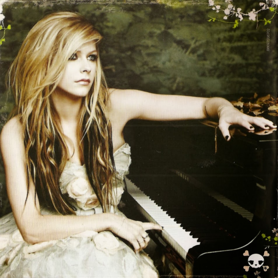
 Perhaps the most important prop used in my music video is the piano. As seen in the music videos for 'I Won't Give Up' and 'Just Give Me a Reason', to create the split narrative instruments as props are used. In my video I have used a grand piano as it is the most prominent instrument in the song. By having the artist sitting at the piano and singing she is tied to the situations through words but is also kept separate from them. I feel it is very much more effective and interesting for my target market (young males and females of the E and D socio-demographic group) to have the singing and playing combined as the camera angles can be more varied and body language of the actress is a lot more genuine than her just standing around. Perhaps if the song has a faster tempo it would be more appropriate to have her dancing but as the song and the ideology are more sombre the piano is the perfect prop to be used.
For my singer, Katherine-Anna, I asked her to wear some simple black clothes with a red headband. The black clothes once again represent the tone of the song but also take away her individuality as she represents millions of people in the world ho have problems. Her red headband not only acts as a constant feature across all three of my artefacts but again links into the red worn by some of my characters and indicates the pain that they are in, be it emotional or physical.

 Settings: Again similar to Katy Perry's video all of the settings I chose were everyday settings so that they reflect these everyday situations of each of my characters. The bedroom of the alcoholic for example shows her solitude and her secret addiction (representing the problems part of my ideology and her self medicating solution). I would imagine that many of my target audience, being teenagers and of a generation who spend a lot of time online, could relate to this setting. It also directly links to the lyrics at this point in the song as my character is 'lying in an empty bed' and 'all the alcohol in the world would never help [her] to forget'.
The public park bench that is inhabited by my homeless character is another example of an everyday setting as everyone walks or travels past once almost everyday and sees homeless people. This means that the audience of my video should be able to identify with this scene very well.
 The graveyard setting is another place that is important to the characters story, whilst in Katy Perry's video the girl with cancer is in a hospital, in mine the boy whose mum died is in a graveyard. Both of these settings aid the audience to understand the stories a little better as they directly represent a key feature in my characters and probably target audience's lives.
 The setting for my singer is in a public place. Again similar to Katy Perry's video where they all gather in a public square at the end and she stands on top of a building visible by all, my character is reachable by the public as she is in a public glass building setting which acts as an opposite to many of my characters who are isolated in their settings. As she is the one imposing the ideology of 'you're not alone' it is fitting that she is not shown isolated.
_________________________________________________________________________________________
Stock Characters: Every one of the music videos contains the artist, (once again the donor/helper according to Propp as she helps the audience/characters relate to the song and being a key example that everything will be okay in the end) taking this into account I made Katherine-Anna a prominent character in my music video. By regularly showing her the audience become familiar with her which is important when establishing a profile, especially for a new artist. This also allows me to use her image across my two ancillary products as
 well, creating a consistent marketing campaign and public image for her.
Whilst P!nk's video simply contains two people, one being herself, Katy Perry and Jason Mraz's videos contain other people too, once again all depicting individual stories that link to the songs ideology. This is why I decided it was important that I too include a variety of people, each depicting something different. In doing this I hope to attract a wider audience as there is more than one character that they can identify to. One fall back I would say of P!nk's video is that the audience must only be able to identify with either the man or the lady and it is rather specific. By following the examples of Katy and Jason, I aimed to avoid this problem.
_________________________________________________________________________________________
Stock Events: Split narrative was a central point for all three of the videos I analysed. Therefore, I based my music video around the same principles. By including shots of Katherine-Anna on the piano there is the basis of the video. All the other events are essentially extras to explain the story an ideology in the lyrics. The split narrative is also important in keeping the audiences attention. If the whole video involved them having to ponder over lots of different stories constantly then it would not be very popular as it would be too difficult to watch.
 The basis of my stories are taking from difficult situations that my target audience could experience. I did this again so that they have a chance of identifying with the storyline, which would make the video appeal to them more.
In media Enigma Code and Action Code are always important in not only engaging the audience but telling a story shown in the stock events. I used this a several points in my music video, but one significant part is when I introduce the young girl sitting on her bedroom fall looking upset. This makes the audience question why she is feeling like this way. This is the Enigma code part. The next part is the action code where a flashback provides and answer to the audience in giving them the information that she has in fact been abused and chucked in her room by a parent.
_________________________________________________________________________________________
The basis of my stories are taking from difficult situations that my target audience could experience. I did this again so that they have a chance of identifying with the storyline, which would make the video appeal to them more.In media Enigma Code and Action Code are always important in not only engaging the audience but telling a story shown in the stock events. I used this a several points in my music video, but one significant part is when I introduce the young girl sitting on her bedroom fall looking upset. This makes the audience question why she is feeling like this way. This is the Enigma code part. The next part is the action code where a flashback provides and answer to the audience in giving them the information that she has in fact been abused and chucked in her room by a parent.
_________________________________________________________________________________________
Narrative & Representation Theory:
The representation theories I have used in my music video are very similar to the ones I found in Jason Mraz's video, and as our song ideologies are alike it was possible to do this. The Constructionist Theory within it is important the audience must make up their own mind as to what the video means to them, and what everyone's problems are that they must overcome. Whilst I have chosen specific problems for each character the audience may view these differently and this can make it more personal to them. That being said, I have also Reflective Theory of Representation is present within this music video as I have created the whole ideology of the video around my views that everything will work out fine in the end and that no-one should be alone in their struggles. Due to this one could also say there is an element of the Hypodermic Needle Theory as my own ideas, as director, are subtly fed to the audience through the way I have presented my music video.
In terms of narrative theories, one could say that there is an element of Todorov's Narrative Theory in my video. Much like all three videos I analysed my video depicts a break of equilibrium. By starting with the Katherine-Anna on the piano an equilibrium is set, then it is broken as all of the stories are told. The attempt to fix this is shown in the pictures of the target audience with their 'you're not alone' posters, then it ends with Katherine-Anna once again on the piano as a new equilibrium has been found. Katy's version of this would be the characters becoming fireworks after their misfortune or sadness, P!nk's would be the breakdown of her relationship finally being discussed openly and for Jason Mraz each individual finds their happiness as the video progresses.
_________________________________________________________________________________________
 |
| Equilibrium - Disequilibrium - New Equilibrium |
In terms of narrative theories, one could say that there is an element of Todorov's Narrative Theory in my video. Much like all three videos I analysed my video depicts a break of equilibrium. By starting with the Katherine-Anna on the piano an equilibrium is set, then it is broken as all of the stories are told. The attempt to fix this is shown in the pictures of the target audience with their 'you're not alone' posters, then it ends with Katherine-Anna once again on the piano as a new equilibrium has been found. Katy's version of this would be the characters becoming fireworks after their misfortune or sadness, P!nk's would be the breakdown of her relationship finally being discussed openly and for Jason Mraz each individual finds their happiness as the video progresses.
_________________________________________________________________________________________
Codes:

 Camera Angles: From my research I found that many different camera angles were used, and so I have tried to incorporate as many as I can into my main artefact making sure that they held meaning too. Some
examples of this would be using a high angle shot to look down on the homeless girl as she takes the glove from the tree, this helps to represent her as one of the heroes in my story as she is clearly vulnerable (as the audience look down on her) and is searching for items to help her to survive. I also used the same idea for looking down on the girl who was abused. For the shots of my singer I tried to keep them mostly at eye level so that she was not seen as superior to the characters in the video.
_________________________________________________________________________________________
 Camera Ranges: As I found from my research it is important to use a variety of camera ranges so that the music video is not all shot at one level and is more interesting for the audience. Bearing this in mind, I used several close-ups of the characters faces to show the emotion on their face. One example of this would be for the lonely boy when I used a close-up shot so the audience can clearly see the sadness in his face. But I also included mid-shots and long shots that set the scene and show the characters full identity, notably when the homeless girl is on the bench, so that the audience can see her full costume indicating her homelessness.
_________________________________________________________________________________________
Composition: Having discovered in my research the frequent use of the rule of thirds when composing shots, I transferred this into my own music video. The main places that this is prevalent is during the shots of my Katherine-Anna, but I have also included it in shots when my characters are still, like the girl sitting on the floor in her bedroom. For this shot in particular by placing her slightly to the side also represents the unrest and upset in her life._________________________________________________________________________________________
 Editing: In my music video I tried to use a range of transitions between shots like I saw in my research. This worked particularly well due to the style of song as it enabled me to use some slow fades as well as some jump cuts in the slightly faster parts. Other editing I used that can be difficult to identify in existing products, included changing the colour of the shots slightly to indicate flashbacks, blurring out unwanted reflections and slowing down or speeding up some clips to create a nice effect. I decided to use a slow motion shot as Katy Perry effectively used one when the girl jumps into the pool. This extra time to see the shot helps the audience understand the situation better than at full speed.
_________________________________________________________________________________________
 POV: Much like the POV shots in the videos I analysed, I used a few to show the struggles that my characters faced. The most prominent one would be when he teenage boy looks at the photo of him and his mother when she was alive. By doing this, it has not only informed the audience of the situation but puts them in his shoes and helps the identify with the story better.
_________________________________________________________________________________________
 Lighting: As I found in P!nk's music video, lighting is very important in portraying the tone and ideology of the video and song. Combining edited and on set lighting the majority of my story lines are relatively dull, this shows the first part of my ideology highlighting my characters sorrowful problems. The scenes of the singer on the piano however, are relatively light indicating the possibility of hope and happiness in the stories (this relates to the second part of my ideology that everything will be okay in the end as it has for my singer) but also helping to highlight my split narrative.
_________________________________________________________________________________________
 Mis-en-scene: Unlike when I did research for my foundation portfolio I found very little mis-en-scene in the music videos I analysed. Therefore, I tried to keep it to a minimum when producing mine. One notable one would be the inclusion of other graves at the grave yard. I made sure I included this so that it shows he was not alone in his grief.
_________________________________________________________________________________________

_________________________________________________________________________________________
Conventions:
Images:
 -Main Image: Taking inspiration from Jessie J's magazine advert I decided to use Katherine-Anna as my main image on my advert. In doing this I have made her instantly recognisable across all three products I have produced. Her expression is happy as she looks down at the poster. This shows her belief in the ideology and is her showing her audience that she will be ok. Her smile also shows her kindness and approachability. In addition, she would appeal to my target audience well as she is around the age I want to attract, and one could also say that Male Gaze Theory of Representation is present as she is very attractive.
  Motif: As mentioned previously, in the Paramore advert they included a motif that was then replicated to the digipak. Here I have done a similar thing, replicating a simple swirl border across my two ancillary texts, acting as an aide memoir for the reader and buyer.
-Front Cover: I have included a picture of the front cover of my digipak on this advert so that anyone who has seen the advert would then recognise the album on a CD store shelf or on ITunes. Although I only found this feature on one of the adverts I analysed I think it works really well and is essential in a marketing campaign for an album.
-Logos: I have placed all of the logos at the bottom of the advert, as found in throughout my research as they are less important so would not be the main focal point of the advert.
-Logos: I have placed all of the logos at the bottom of the advert, as found in throughout my research as they are less important so would not be the main focal point of the advert.
 -Shadows: There were hardly any shadows on the adverts I analysed, just a few on Jessie's face and some surrounding the front cover of the Paramore digipak. I decided this made the adverts appear more professional so I have removed any shadows from the background on the main image and added two simple shadows to the edges of the digipak so that it stands out from the rest. A few shadows are left on Katherine-Anna's face to highlight and define her facial features and complexion.
  Setting: Again much like Jessie J's advert the setting I chose for the photoshoot was a white wall. In doing this I have ensure that all the reader's attention is on the key information and my main image. Any items in the background would be too distracting as the writing needs to jump out at the reader as they flick through a magazine.
  Costume: I kept the costume of my artist very simple and reserved in this artefact just like in my music video. This was partially to make sure that it was unobtrusive and didn't detract from the important information, but also that it kept inline with the colour scheme of my advert. In all of the existing products I looked at, the costume was directly linked to the colour scheme so I have made sure I stuck to these findings to make my advert look as realistic and appealing as possible. Once again, her costume is current and in fashion, depicting her as a part of my desired target market and represented social group as she fits in perfectly with their norms and values. Moreover, the red hair band links her to the pain in her life as well as others, but also signals her as a helper/donor (Propp's Narrative Theory) as people normally associate the colour red with help. A prime example of this would be the use of red in the Red Cross Logo.
Representation: The magazine advert for Paramore contained three identifiable representations, all of which I have tried to replicate in my own magazine advert.
 -Target Audience: As mentioned earlier, by using Katherine-Anna as the main focus point my target audience is directly represented. In addition, by including a text number like on the Paramore advert I hope to appeal to a young audience interested in technology.
  -Artist: It is clear that my artist is represented on my advert. The image of her instantly gives the audience an idea of her personality and constructs her public profile.
-The Album: Finally the album is another representation made present. Taking the idea from Paramore's advert the front cover is clearly visible and by maintaining a house style across all three products the genre of music is represented well.
Codes:
Text:
-Main Text: In terms of text I have taken elements from each existing advert to create my own, some of these include: the artist's name, the album title, featured songs, release time frame, website and information on how to receive a song via text.
-Register: The focused attention span of young people in our day and age is only eight seconds. This means that the information on my artefact needs to be direct and straight to the point so that my target market could obtain all relevant in eight seconds or less. Consequently, the register is simple and straight to the point, as my target market of young people would not be interested in long complicated words and sentences, and they would lose focus without absorbing all relevant information.
-Font: I kept the font consistent throughout, using the standard front called 'Bell MT'. This serif font gives the hint of class and sophistication to the advert and also the album. The font used for 'I'll Be Ok' and 'Katherine-Anna' are the same as used on the digipak to create a house style, something I found to be often used when I conducted my research of existing products.
-Size: As expected from my research findings, all the important information is larger whilst some les important details are in a smaller font, this ensures that the vital text is clear to the reader as they flick through the magazine.

_________________________________________________________________________________________
-Main Text: In terms of text I have taken elements from each existing advert to create my own, some of these include: the artist's name, the album title, featured songs, release time frame, website and information on how to receive a song via text.
-Register: The focused attention span of young people in our day and age is only eight seconds. This means that the information on my artefact needs to be direct and straight to the point so that my target market could obtain all relevant in eight seconds or less. Consequently, the register is simple and straight to the point, as my target market of young people would not be interested in long complicated words and sentences, and they would lose focus without absorbing all relevant information.
-Font: I kept the font consistent throughout, using the standard front called 'Bell MT'. This serif font gives the hint of class and sophistication to the advert and also the album. The font used for 'I'll Be Ok' and 'Katherine-Anna' are the same as used on the digipak to create a house style, something I found to be often used when I conducted my research of existing products.
-Size: As expected from my research findings, all the important information is larger whilst some les important details are in a smaller font, this ensures that the vital text is clear to the reader as they flick through the magazine.
_________________________________________________________________________________________
 Layout: When I analysed the 'Who You Are' advert for Jessie J, I discovered that all important information was placed in a column down the middle, which I have tried to replicate as far as possible in my own advert. I also liked the black band at the bottom. This addition to the advert meant that information did not have to be put on the main image itself making it easier to include more details. In my own, I have a small strip at the top with the website on it, then a second at the bottom containing all other important information.
_________________________________________________________________________________________
 Colour: Colour schemes featured on all the products I analysed. Due to this I have made sure to only select certain colours and have then re-used these across my two ancillary texts. On Jessie J and Evanescence's
adverts they both included gold. I found that this specifically jumped out at me, so I have therefore put key words and information in a deep yellow so that they are instantly picked up by the audience.

_________________________________________________________________________________________
3rd Product Analysis (How I Have Used Codes & Conventions)
Conventions:
Images:
 -Front Image: The main image on the Radio:Active and Avril Lavigne's digpaks were of the artists themselves. Whilst the cartoon was interesting on Go Audio's front cover it was not quite the style I was looking for when designing my digpak. Keeping this in mind, I made the main image on my front cover the artist, Katherine-Anna (who would also fit in with my target market of young people, so they can easily identify with her). As she is present in the video and on the advert this creates a nice link between all three of my artefacts and makes her immediately recognisable to her target audience. Her facial expression shows not only her concern for the audience but a slight determination that is eye catching for the audience. This links to my ideology, in that she is determined and confident that everything will be okay in the end. If the worry had completely taken over her face the audience would not have found faith in her as she is not presented as a strong, trustworthy role model.
  -Back Image: The image on the back is similar to the main one of my advert. By using the 'I'll Be Ok' poster here it is now present across all the products, reminding the audience of the name of the album and song as well as the music videos ideology. In the bottom right corner I have also included a barcode which I found is a key feature of a digipak and is often found here.
Motif: As I mentionned earlier, the swirl motif is also present on every face of my digipak, inside and out. This not only makes the digipak more interesting on some of the more plain sides but is part of my established house style.
-Logos: Once more I have included the record companies logo on the back of my digipak and on the spine. I did not put it on the front as I felt it was a distracting from the main image, and I also found in my analysis of Radio:ACTIVE that it can be placed on the back.
 -Shadows: When editing the picture for the front cover of my digipak I made sure I removed any shadows around Katherine-Anna, to make it look more professional and realistic.
-Logos: Once more I have included the record companies logo on the back of my digipak and on the spine. I did not put it on the front as I felt it was a distracting from the main image, and I also found in my analysis of Radio:ACTIVE that it can be placed on the back.
-Shadows: When editing the picture for the front cover of my digipak I made sure I removed any shadows around Katherine-Anna, to make it look more professional and realistic.
-Audience Participation: On the inside of the digipak I have used some of the photos from my music video. This not only links my products together but is a direct link to my desired target audience as these girls are the correct age and could be seen as fans. It also shows the ideology of the music video and album. I have created some 'sellotape' to hold these pictures on like I found in my analysis of Paramore's advert, which makes the inside a little more interesting.
_________________________________________________________________________________________
Setting: As with my advert I kept the setting to be a plain white wall so as not to distract the buyer/audience from the main image and important information. Inside, I chose a 'cork-board' style to bring some colour to the digipak.
_________________________________________________________________________________________
Costume: Katherine-Anna's costume is again black to maintain a house style but is also lace. I chose this as it has a nice design which fits in well with the sophisticated style of the digipak. Although Avril Lavigne's costume was white, it was of the same sort of style, being sophisticated, so I applied this finding to my own digipak. Like in my main and second artefacts, her costume is up to date and similar to the style that my target audience (young females and males) would recognise in their own wardrobe if not their friends and families, this represents her as someone who is reachable and not out of this world (if I had dressed her up in futuristic clothing she would not fit into their social group and they would therefore feel she was not accessible and would consequently not be able to identify with her and my ideology). The bold colours show her as strong which is a key characteristic for the helper/donor in Propp's Narrative Theory, this continues to indicate how each is important in creating this profile.
Representation:
-Target Audience: On the inside of Go Audio's digipak they included pictures of their fans at gigs. I like this
 idea as it quickly identifies a target market so I included some of the photos I collected on Facebook for my music video on two of the inside faces of my digipak.
-Artist: All three albums contained pictures of the artists even if Go Audio did not have any on the front. On mine I placed an image of the artist on the front and the back meaning which ever way the digipak was laying the artist would be instantly recognised. Whilst on the advert Katherine-Anna is smiling, on the pictures on my digipak she has a more neutral expression which I have used in attempt to indicate an elegance to the digipak.
_________________________________________________________________________________________
Codes:
Text:
 -Main Text: Directly taking my research into account on the front of my digpak I only included the artist's name and the album title. At that stage there is no need for any extra information. On the back I put the copyright details and track listings just like I found in my research. In Go Audio's digipak they included a face with a decication on. I really liked this idea as it can make it more personal to the artist, hence I have written a dedication which I have placed on the 3rd face.
 _________________________________________________________________________________________

Layout: It was important that the layout was eye catching and stylish on the front of my digipak. Taking inspiration from Avril's front cover I placed the picture of Katherine-Anna on the right and placed the text to the left of her face, with the motif around it. This leaves some empty space at the bottom left which ensures the front is not too over crowded.
On the back I placed the track listings to the left and the additional information at the bottom much like I found in my research of existing products. Once again similar to Avril's back cover I placed the image of the artist on the right hand side.
 The inside is also very simple - pictures placed on either side stuck on with 'sellotape' to replicate my target audience's own memory boards, with the space for the CD in the middle.
_________________________________________________________________________________________

Colour: As I found in my research of both adverts and digipaks a house style and colour scheme is essential across both products. Therefore I have been careful to only use a select few colours on my digipak. I replicated the red in Katherine-Anna's headband to her real lipstick and also the lipstick mark on the 3rd face to carry on this theme throughout.
The colour scheme on the inside is slightly different as I opted for a cork board background which just adds in a little bit more colour the digipak without changing the house style completely.
_________________________________________________________________________________________
Main Product Analysis (How I Have Challenged/Developed Codes & Conventions)
_________________________________________________________________________________________
2nd Product Analysis (How I Have Challenged/Developed Codes & Conventions)
Text (Code): At the top of my advert I included a review from 'The Guardian'. Although I did not find this in any of my research I decided it would help to entice a buyer in. On many film adverts there are reviews by top newspapers or critics and this extra piece of information gives the buyer a reliable source about the quality of the album they are buying if they have never heard of the artist or heard any of the songs before.

Social Media Logos (Code): I was very surprised to not find any social media logos or information on any of the existing adverts I analysed. In the society we live in these days people (and my target market in particular) are always looking to follow their favourite artists on Twitter or 'like' them on Facebook. Hence, I have included logos for both Twitter and Facebook as well as direct links to the artists pages. I have also added a 'hashtag' for the two sites so that the audience can tag it in their posts allowing a community to grow online and people get in touch with each other.
3rd Product Analysis (How I Have Challenged/Developed Codes & Conventions)
 Layout (Code): Looking at the inside of Go Audio's digipak, there were loads of different photos all placed on top or close to each other leaving no gaps in between. Whilst I like the idea of using audience photos I felt that for my digpak it was not appropriate due to the style of music I am promoting. With that said, I developed my findings and placed just three photos on two of the faces which clearly depict my target market and audience but do not overcrowd the sides like in the 'Made Up Stories' digipak.

Image Shadows (Conventions): Most of the photos I saw on the digpaks I analysed had no shadows and I have mostly replicated this. However, on the back of my digipak I have left the shadow on the right hand side of Katherine-Anna because I feel like it creates a nice gradient effect on this side. The front side and the 3rd side backgrounds are simply grey and whilst this is a look I was keen to obtain. The slightl gradient on the back breaks up nicely the grey of the other two sides and just adds a bit of colour to the outside of the digipak.
Colour: As I found in my research of both adverts and digipaks a house style and colour scheme is essential across both products. Therefore I have been careful to only use a select few colours on my digipak. I replicated the red in Katherine-Anna's headband to her real lipstick and also the lipstick mark on the 3rd face to carry on this theme throughout.
The colour scheme on the inside is slightly different as I opted for a cork board background which just adds in a little bit more colour the digipak without changing the house style completely.
_________________________________________________________________________________________
Main Product Analysis (How I Have Challenged/Developed Codes & Conventions)
There was very little I wanted to challenge or develop about the codes and conventions of music videos as I wanted it to be as realistic as possible, but to make my video unique there were some aspects that I challenged or developed.
Editing (Code):
 Due to the song I chose being relatively slow, I felt the need to use a slower editing technique. Fast edits like those found in the videos I analysed would not have portrayed my ideology how I wanted to. Therefore, the majority of my shots are longer than those of a conventional music video but in being so the meaning is conveyed better.
Representation (Convention):
 One way I challenged the conventions of a music video was by including real members of my target audience. Whilst Katy Perry's video contained people likely to be her target audience, and mind did too. I took to Facebook and asked my target market to make signs and take photos of themselves so that they could be included in the video. This way representation of my audience was incorporated directly into my video.
Stock (Code):
 This links to another way I have developed the traditional codes and conventions of existing music videos. Normally they are made up of solely video, but with the inclusion of photos I have added another unique aspect to my video that I have not seen before.
Editing (Code):
Due to the song I chose being relatively slow, I felt the need to use a slower editing technique. Fast edits like those found in the videos I analysed would not have portrayed my ideology how I wanted to. Therefore, the majority of my shots are longer than those of a conventional music video but in being so the meaning is conveyed better.Representation (Convention):
One way I challenged the conventions of a music video was by including real members of my target audience. Whilst Katy Perry's video contained people likely to be her target audience, and mind did too. I took to Facebook and asked my target market to make signs and take photos of themselves so that they could be included in the video. This way representation of my audience was incorporated directly into my video.Stock (Code):
This links to another way I have developed the traditional codes and conventions of existing music videos. Normally they are made up of solely video, but with the inclusion of photos I have added another unique aspect to my video that I have not seen before._________________________________________________________________________________________
Text (Code): At the top of my advert I included a review from 'The Guardian'. Although I did not find this in any of my research I decided it would help to entice a buyer in. On many film adverts there are reviews by top newspapers or critics and this extra piece of information gives the buyer a reliable source about the quality of the album they are buying if they have never heard of the artist or heard any of the songs before.
Social Media Logos (Code): I was very surprised to not find any social media logos or information on any of the existing adverts I analysed. In the society we live in these days people (and my target market in particular) are always looking to follow their favourite artists on Twitter or 'like' them on Facebook. Hence, I have included logos for both Twitter and Facebook as well as direct links to the artists pages. I have also added a 'hashtag' for the two sites so that the audience can tag it in their posts allowing a community to grow online and people get in touch with each other.
Layout (Code): Looking at the inside of Go Audio's digipak, there were loads of different photos all placed on top or close to each other leaving no gaps in between. Whilst I like the idea of using audience photos I felt that for my digpak it was not appropriate due to the style of music I am promoting. With that said, I developed my findings and placed just three photos on two of the faces which clearly depict my target market and audience but do not overcrowd the sides like in the 'Made Up Stories' digipak. Image Shadows (Conventions): Most of the photos I saw on the digpaks I analysed had no shadows and I have mostly replicated this. However, on the back of my digipak I have left the shadow on the right hand side of Katherine-Anna because I feel like it creates a nice gradient effect on this side. The front side and the 3rd side backgrounds are simply grey and whilst this is a look I was keen to obtain. The slightl gradient on the back breaks up nicely the grey of the other two sides and just adds a bit of colour to the outside of the digipak.
No comments:
Post a Comment