Showing posts with label Digipak. Show all posts

Friday, 7 March 2014

Evaluation: Question 2

Q2: How effective is the combination of the main product and ancillary texts?


If the Prezi does not work for any reason please see the text for it below.
In my foundation portfolio, I was given the chance to produce just one artefact, this meant that I was unable to show any house style. This year, with the creation of three products aimed to promote an album release I could effectively create and present a clear house style across all three of my artefacts. This meant I could also carry an ideology across all artefacts that despite your current problems everything will be okay in the end. I did this mainly through the use of the album/song title but also in the use of a poster as an auteur prop.
Codes & Conventions
The codes and conventions used across my three artefacts were very important in creating my house style and also portraying my ideology. As far as Stock Character goes, it was imperative that I kept my artist present in all my artefacts. By doing this, it is immediately clear that the music video, magazine advert and digpak are all part of the same campaign. 
In all three artefacts I also made sure that Katherine-Anna was wearing at least one piece of clothing/costume that was the same and the rest was similar. I did this not only to create a house style across the three, but also to help represent my ideology. The red bandana, shows the pain shared by all my characters whilst also linking all three products together. Another aim I had of using this red bandana is that my target market will associate this item of costume to my artist which would help create a instantly recognisable public profile for her. 
In terms of text as a code, I made sure that I used the same font in my main product and ancillary texts. Fonts have certain connotations, so by using the same serif style throughout all three, I have created a solid house style and meaning across each artefact.
By often presenting Katherine-Anna at an eye level camera angle, it makes it more personal for my audience as she is neither shown as weak nor more important than them. Similarly, in terms of composition, placing her at the side of shots across all three artefacts the audience should feel more comfortable according to the rule of thirds as this is more pleasing to look at than something constantly placed in the middle of a shot.
One Auteur prop I used throughout the campaign was a sign reading 'I'll Be Ok' this does not only immediately indicate my ideology (see top for full description) but by asking my target audience to make my own and including them across my artefacts I have created solidity and directly represented my desired social group. I have never seen this done before in a campaign making this idea Auteur.
Photo shoots and filming were stock events across the making of all three of my artefacts. I held two photo shoots with Katherine-Anna to get photos for the two ancillary products (one picture I also used in my music video) and another photo shoot I held was to get the photo of the young boy and his mum to use in my main artefact. For each shoot I took a range of photos, selected the best ones edited them to make them look more professional.
Ideology
With my main ideology being strongly represented in my music video, it was important that I carried the same ideas across to my ancillary texts. To do this I used a picture of the singer holding her 'You're Not Alone' sign in each of my products. To reinforce this, I also included some of the photos of my target audience holding their own sign inside my digipak as well as in the video. This is also key in the representation of my target market. 
Representation of social group
It is very important to represent a social group in any media text. One way I combined this aspect in my main text and ancillary texts was in the selection of my singer and characters. Everyone I have chosen to present would be part of the teenage social group. As this group is my target audience, I needed to keep them constant across all three artefacts so that my audience can easily relate to the individual characters as well as my ideology. In my digipak, I used some of the 'I'll Be Ok' and 'You're Not Alone' pictures that were made by my target audience for my music video. From my post-production research I found that this was an aspect that the teenage social group really liked. Not only are they a direct link to my ideology but they also are a direct representation of my desired social group. 
Audience Theory
Uses and Gratifications Theory says that an audience may use a text for personal identity, as they find themselves reflected in them and learn new values. By combining all three of my texts, my aim is that my target audience will be able to relate to the characters but also will take on my ideology of everything will be ok in the end. My ideology is presented on the forefront of all three of my products but most obviously in the title of the album and in name of  song for the music video. 
Narrative Theory
Propp states that in any media text there will be certain characters. One of these is a donor/helper; from my main product to my ancillary texts I have presented my singer Katherine-Anna as this character. In all three she holds a sign saying 'I'll Be Ok'. From this, you could say that she is presenting all the characters as well as my target audience with the hope that they are looking for, which is in effective across all the texts I have produced. One other character Propp defines is the hero - someone who is searching for something. Seen in both my digipak and my music video, my target market (young females and males of the socio-demographic groups E and D) is shown holding signs saying 'I'll Be Ok' this shows how they are searching for happiness and therefore links them to the hero persona across my products. 
Awareness of audience expectations
Before starting to plan or make my products I gathered information from my target audience on what they expected to see in a music video, magazine advert and digipak for the style of song I selected. During construction I held some focus groups and created more surveys to make sure that the products I was making were what my audience were expecting, and that they were as realistic as possible. 

Sunday, 16 February 2014

Post-Production Research & Feedback

This is a post I put on Facebook appealing for my target market, and some outside of it, to provide me with feedback on my completed Magazine Advert and Digipak, before I make some final changes for my final draft. The feedback I received for both artefacts was very encouraging. The pictures below indicate the general thoughts and main points raised.


First impressions are key when selling something so it was imperative that my audience felt this way when looking initially at my digipak. 

 I'm glad that my target market liked my colour scheme. I was reluctant to use very bright colours because it did not fit the style of the music, even though it is the stereotypical style for a 'pop' album. 

 One key point here was the inclusion of the young people making the media more accessible which was my main aim in including members of my desired target audience of young males and females. 
I only saw this in one of the digipaks that I analysed but I thought it was a lovely touch, and once again helped to engage and include the audience. It appears here that my target market agreed with me.
 This feedback was extremely pleasing, showing that I have managed to capture what my target market want to see in an advert.
Once again, this shows that I have included consistency, another aspect that lies well with young males and females.
 One comment here says that it looks a little old fashioned. To try and make it look more current, I plan to add in a text number in which my target audience can text to get a song, something that is likely to appeal to them as the technical generation. I hope this will also make it a little more interesting as it will be busier. I want to also try to lighten the photo a bit to make the advert more eye catching.

Saturday, 18 January 2014

Fonts - 2nd Draft Supporting Artefacts


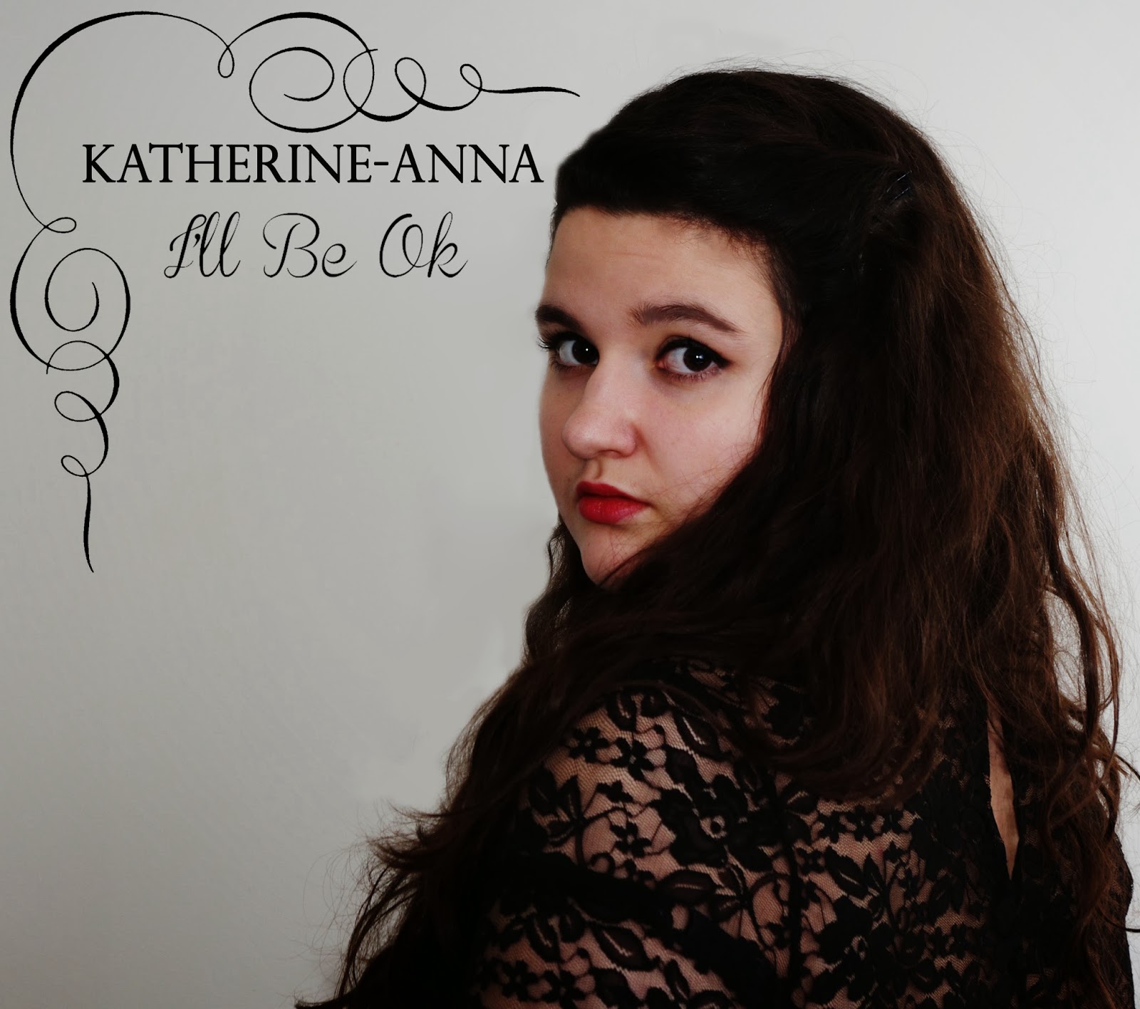
Above is a diagram of my favourite fonts for 'Katherine-Anna' and 'I'll Be Ok' for my digipak front cover. The ones I will use have been placed in a pink box.
For the artists name I wanted a plainer style and one that showed the sophistication and seriousness of the song and ideology. Serif fonts are usually viewed as more serious so I have selected this style partially due to this but also because it is quite simple, especially in capitals.
Carrying on the theme of curly writing for 'I'll Be Ok' from my 1st draft I found various styles that I like. I have chosen one that is still fairly simple compared to others and isn't too bold, busy or difficult to read. Having the same boldness as the other a theme is held amongst them and they both work nicely together.

Tuesday, 14 January 2014

Notes for 2nd Draft - Supporting Artefacts

Much like my music video on completing my two supporting artefacts of a digipak and music magazine advert I asked some of my target audience to make comments on how to improve them both. To do this I held a small focus group before showing them the advert and digipak I explained about my ideology and showed them the music video so they understood a little better what I was aiming to achieve in making them.

"Georgia: "I really like the photo of Katherine, it's very natural and definitely suits your ideology, but I'm a little unsure about the effect you have used. It looks nice but I think both artefacts would appear more professional with just a straight photo with no effects."

Florence: "Yeah, I agree with Georgia the photo is perfect but maybe only use it for one of your products. At the moment I would say they are a little too similar. Perhaps keep the photo for the digipak but use another one for the advert."

Rachel: "I think the advert should include social media logos, I often look up bands of Facebook and Twitter so it would be good if you showed that I could do that."

Florence: "I think the social media logos should be on the back of the digipak as well, near where you have said you will put the record label logos."

Georgia: "That would work well! Perhaps you could also spread the track titles out a little bit to fill up the space on the left a bit more. It's great having the picture on the right but I think the left looks a little empty and for teenagers we like things to be quite busy, so the top left corner needs filling slightly.""

I agree very much with all of the points my focus group have made. I also raised the question as to whether they thought the album title was prominent enough on the front cover of the digipak, and although they like it, they thought I would benefit from having it written again near where it says 'Katherine-Anna'. Therefore, I have also decided to change the font of the artists name so that it works well with the font for the album title as I would like to keep the album title in a curly style writing like in the poster, meaning that the font for 'Katherine-Anna' will need changing too. 

Thursday, 5 December 2013

Letters and Briefs to Actors.

Below is the standardised letter/email that I have sent to all of my actors. I decided to make a model then insert the specific details so that everything was clear for everyone, rather than forgetting some details in one and putting too many in another.


"Dear __________________

Thank you for taking part in the filming of my A2 Media Studies music video. Please find below details of filming and costume.

As you know my music video is made up of many different scenarios and you will be involved with the filming of the _____________________. Therefore, could you please wear _______________. I hope to be filming on _____________________ but it could be __________________ if you are not able to make this date or the weather is not appropriate. I hope that filming will take no longer than 2 hours for your part. 

Thank you 

Sophie." 

This letter has been sent to 8 people all of whom are playing different roles in my music video. The actress playing the singer in the music video, will also be part of the magazine advert and digipak, so this was added on the end.

"To take the pictures required for the magazine advert and digipak, could you please make sure that your make-up and costume is the same as in the music video. This will enable me to link the three artefacts together."

Friday, 22 November 2013

Target Audience Research: Digipak.

Once again the majority of respondents were female and aged 13 to 17, which fits in nicely with my target audience, so the following results should reflect their preferences when buying CDs.


As you would expect in this day and age, not many people buy CDs anymore. But, it is still important to have digipaks as there are people who prefer to buy them and the artwork would be needed when someone downloads a song anyway.
From my research on digipaks I found that two of the three had one picture on the front and it is seen here that my target audience prefer that too. They want only the see the album name, the artist and a picture of them. It appears that they do not like the front cover to be cluttered.


From these results I can see that it is very important for the back cover to have the track listings, a barcode and copyright details. Unfortunately, the scores were tied with how many pictures would be preferable. This suggests that, unlike the front cover, my target market is more open to additional features on the back, making it more busy.


Out of the three options given, the majority prefers there to be pictures inside the digipak. Although, because text and information were both chosen too, I may try some designs with some writing inside like the dedication that was in one of the existing digipaks I analysed.


The answer is very clear for this question. Between my advert and digipak I must make sure that there is a similarity which will aid my target market to recognise that the two are linked.


From these answers, it is obvious that a digipak that reflects the music and is eye catching is something that will interest my target market greatly.

Friday, 15 November 2013

Digipak Analysis: Avril Lavigne - Goodbye Lullaby

Front:

Codes:

Text:
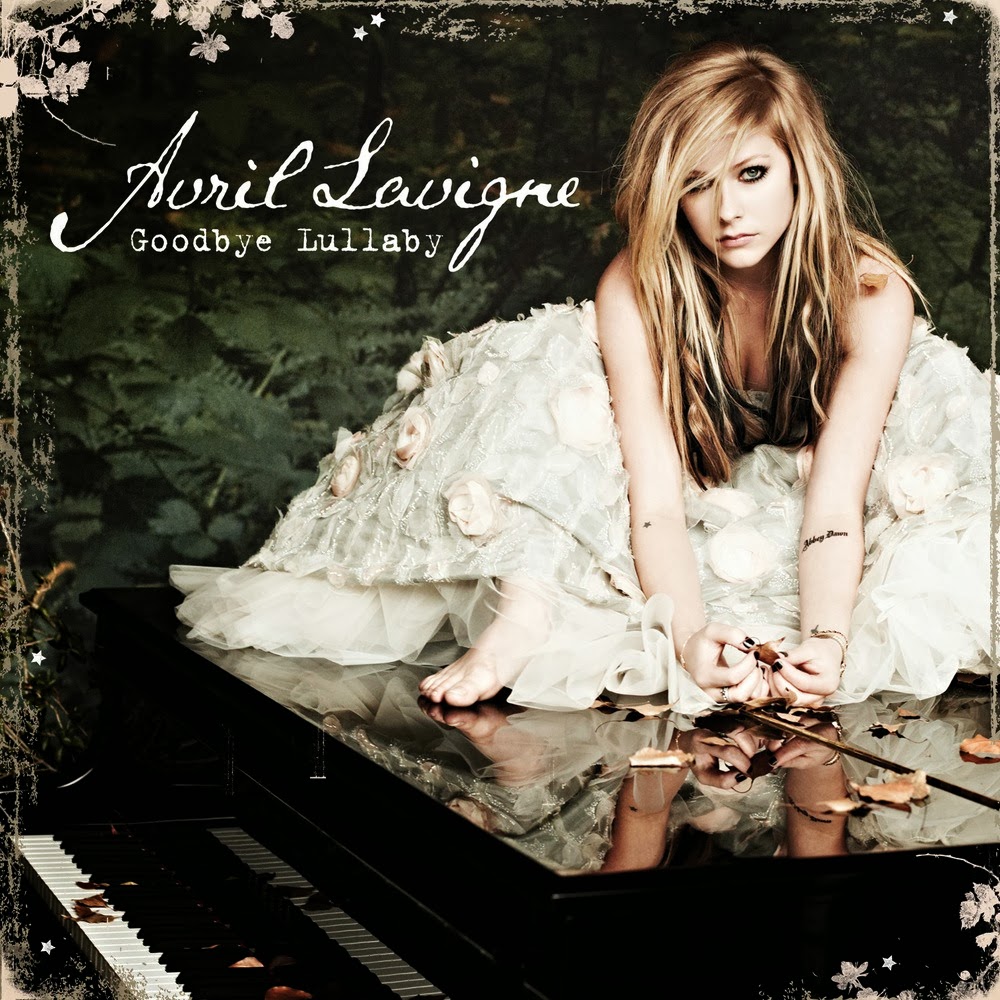
Main Text: Very much like 'Made Up Stories' the only text on the front cover of 'Goodbye Lullaby' the only text is Avril Lavigne with the name of the album.
Font: The font and style used on this front cover is an indication of the style of music that this album is. Normally, Avril would be associated with music that could be classed under pop-rock but this album is very much just pop, which is shown by this more sophisticated font in the style of handwriting. Surprisingly, the title of the album is written in a fairly small font, and is not very eye-catching at all. This is the exact opposite to the albums of McFly and Go:Audio. One can only assume that because
Avril is so well known, the designers are confident that she and the album will be recognised by the picture instead of by the name.

Layout:
Main Layout: Along with the size of the text, the positioning is also rather unusual. By being placed in the top right hand corner it does not take up the main focus point of the centre. Instead, the picture of Avril takes up this prime position as well as the remainder of the cover. However, the placing of Avril's head right next to the two titles does attract the buyers attention to the information needed.
Additional Features: The use of flowers as type of border once again adds to the sophistication of this CD, which very much sets it apart from the style of her previous digipaks.

Colour:
The colours used on this front cover are carried on right the way through the digipak. The majority of the background is black, making Avril and her blonde hair and white dress stand out and attract the buyers attention. Amongst this, there are also a few hints of green, including the album title, which stand out from the dark background, acting as an indicator for the buyer that this is key information. The green also makes the digipak more appealing and exciting to look at, opposed to just a simple black and white front.

Conventions:

Images:
Main Image: An image of Avril takes up the whole cover. Whilst the front cover of Go:Audio's album indicates what their songs might be about, by having Avril sitting on a grand piano (main prop), her album cover subtly suggests the style of music that the album might include. Laura Mulvery might also say that this picture follows her Male Gaze Theory as it is a full body picture, which is likely to be appealing to a male audience.
Additional Image: The only other image on the front is the age certificate suggesting that this digipak will not be suitable for children under the age of 12.

Costume: Her costume is also telling of the style as she is wearing a rather sophisticated dress, opposed to the ripped trousers that she has previously worn for her other album covers. That being said, she still has her heavy eye make-up on making her recognisable to her target audience and existing fans.


Back:

Codes:

Text:
Main Text: As expected the back of this CD contains the track list and Bonus DVD contents as well as the copyright details. Anymore information than this would be wasted on a buyer as it simply would not interest them. Any additional information should be found in the lyric booklet inside the digipak.

Layout:
Main Layout: Following the conventions of a standard digipak back cover, the track listings are placed on the right had side. All of the other information is placed at the bottom in a smaller font which suggests that it is less important, but also so the designers can fit everything on that they need.

Colour:
The colour scheme on the back is carried on from the front cover so maintain the house throughout. This means that if a buyer once only saw the front cover and then another time saw the back cover, they would recognise that it is the same digipak. It is also not very appealing to have one design on the front and a completely different one on the back as it can confuse the style of the CD and artist.

Conventions:

Images:
Main Image: Images on the back include, a similar picture of Avril to the one on the front which takes up the majority of the back cover along with the track listings.
Additional Images: Aside from this there is the logos for the record companies, a barcode and an age certificate. This age certificate is important if there is any offensive music on the CD,
and a record company is therefore obliged to warn a buyer about this.

Inside:

Codes:

Text:
The only text used on the inside of this digipak is the name of the artist and album on the CD along with the
record companies logo.

Layout:
Main Layout: The layout is very simple inside. Taking on the conventional style with the CD holder on the left hand side and space for the back of the removable leaflet on the left. This keeps in line with conventions and is an aspect that I will aim to replicate in my own digipak.

Colour:
As expected, the colour scheme used on the inside of the digipak mirrors that of the rest of the pack. Along with the similar images this ensures a continuity and house style throughout. The use of greens, whites and blacks also indicates the style of music as their duller qualities suggest a more sophisticated pop sound opposed to bright reds, oranges and pinks which would suggest a more upbeat pop style.

Conventions:

Images:
Main Image: Images from the same photoshoot that are used on the front and back are also used inside. This helps maintain a house style throughout.
Stock Character: Once again Avril is the centre of the picture so that the buyer cannot be mistaken as to who the album is for.

Representation:

All codes and conventions mentioned have been used to create a representation of the album 'Goodbye Lullaby'. This rather significant change in style from her previous digipaks suggests a new sophistication to her music that has developed as she got older. Therefore, one could also say that this digipak represents her desired audience as her original fans have also matured and grown up with her. Overall, these features establish the genre of the album so that the target audience can build an idea of what to expect when buying the digipak.

Digipak Analysis: Go Audio - Made Up Stories.

Front:

Codes:

Text:
Main Text: Much like the front cover of Radio:ACTIVE the only text is the name of the band 'Go:Audio' and the title of the album 'Made Up Stories'. This makes sure that the buyer is not distracted by anything else and the key information is retained well.


Layout:
Main Layout: Due to the cover being relatively simple, there is not much to be said about the layout. Only that the two names have been placed in the centre in the top half of the page. The positioning of 'Made Up Stories' makes it the main focus point of the cover as it instantly attracts the buyer's attention. Style: The layout resembles greatly one of a book cover, therefore it keeps in line with the idea of it being a book.

Colour:
The colours used here are striking, like a cartoon which links into the idea that it is a comic or a book. By making the title of the album red against a dark background the buyers attention is instantly drawn to it. By making the sun/moon green, the album appears more abstract, which is enhanced by the presence of a dinosaur in a spacesuit. The red book in the bottom right hand corner also stands out by being red, which draws the buyers attention to the album title which is replicated on the book cover.

Conventions:

Images:
Main Image: The front cover is very interesting and corresponds well with the title of the album. In the image we see and dinosaur in a space suit, who looks to be terrorising a young lady.
Setting: The setting is a green planet with something that resembles a green sun or moon. Obviously, this is supposed to be a 'made up story'  which suggests that the style of this album is going to be very fun and quirky.
Logos: In the top corner, there is a logo which says 'A Go:Audio comic'. The style of this digipak is a little book, as if it were to contain these made up stories. So this logo in the corner enhances this idea as something like this would usually be found on the cover or spine of an actual book. As one would expect, the Go:Audio logo features on the album cover and would be recognisable to any existing Go:Audio fans.

Back:

Codes:

Text:
The text on the back is very minimalistic. There is a simple list of all the songs on the CD which is actually very effective. It is straight to the point and contains all the information that a buyer would actually want to read.

Layout:
Again, the layout is extremely simple. Both the text and the barcode are placed on the left hand side in a structured form which makes it very easy to navigate and read all the titles.

Colour:
By making the background a mixture of blue and black, the red writing stands out really well, once again making it easy for the buyer to read the information. The colour scheme of the background is uniform as it carries on from the colour of the sky on the front of the case.

Conventions:

Images:
The sole image is a barcode which is a pretty standard thing to see on the back of a digipak.

Inside:

Codes:

Text:
As you open the first page of this CD case, there is once again the name and title of the band and album but also a dedication. This is another way in which it follows the format of a book. On the corresponding side at the back of the 'book' is the copyright details. This contrasts with many other digipaks which place theirs on the back conventionally.

Layout:
There is no order to the layout inside as the pictures are arranged in a collage style. This makes it appear less formal and very much like a personal book of memories. Instead of using the standard plastic holder for the CD Go:Audio use a simple sleeve at the back.

Colour:
The majority of the photos are either dark or in black and white. The dark ones are mostly from their live concerts whilst the black and white ones were done professionally for this digipak despite the want for it to be quirky like a comic. The very front page and page with the sleeve on are simply black and white with pencil sketches covering them, which looks like the beginnings of a comic.

Conventions:

Images:
Main Images: The images inside make-up pretty much the whole thing. Before we get to the CD there are four double sided pages of photos of the band. This gives the buyer an idea of their personalities which can be important for some people as they like to know about the band and feel a sense of connection.
Target Audience: There are also pictures of fans on these pages which once again shows how they value their connections with their fans. The majority of the pages have 'Go:Audio' written in various forms e.g. in sand, in fridge magnets and on a drum kit. This is a constant reminder for the buyer who this band is.


Digipak Analysis: McFly - Radio:ACTIVE

Front:

Codes:

Text:
Main Text: As you would expect with a digipak the text is limited on the front. Obviously, the name of the band and the album are featured.
Additional Text: If you look closely on each, individual picture in the corner there is a small bit of text saying "Radio:ACTIVE 20/09/08 20:15" although the time changes on each one. By doing this the audience subconsciously if not consciously sees Radio:ACTIVE about 10 times on the front cover alone, aiding the retention of the name.


Layout:
General Layout: The layout of this front cover is very well thought out. Each member has their own box and in turn are shown to be looking at each other. This makes the cover appear more interesting opposed to just having them staring out at the buyer. Information Layout: Of course, the McFly logo of their name, is placed right in the centre of the cover making it the main focus point of the front cover.

Colour:
The colour scheme used throughout the entire digipak is related to the title of the album - Radio:ACTIVE. When one thinks of something being radioactive, one normally thinks of a vivid green item, and this is relayed through the colour scheme of the CD and DVD case. It is important to maintain a constant colour scheme across all products associated with this album so that there is a recognisable link.

Conventions:

Images:
Main Images: As for the images each member of McFly has there own separate picture on a TV screen as if they are being surveilled. Each member acts as a Stock Character as they are recognisable by the bands current fans and they are in effect the band's representatives.
Logos: In between them the logo for this album of the old style microphone with a mouth is featured in the remaining squares. McFly have continued to use this logo, on merchandise since the release of this album. Therefore, this makes this album instantly recognisable to be McFly if you failed to notice all the other images and clues which tell you who it is as well. Surprisingly there is no logo for the record label who produced this album, this is quite unusual but I expect it will be present elsewhere.

Costume:
The costume of the band is a little difficult to see, and is not a very important factor in this digipak. From what we can see it appears that they are wearing simple everyday clothing. Two are wearing shirts whilst the others are simply wearing t-shirts. The use of black and white, stripes and squares shows there diversity and can link them to their target audience as they are likely to be something they would wear. 

Back:

Codes:

Text:
Main Text: Following the normal conventions of a digipak, the back lists the songs that appear on the CD and also the items that the buyer can find on the bonus DVD.
Additional Text: Underneath that, details of their management and production team are listed along with the copyright terms. All of this text is rather small as it is not intended for the buyer to read as soon as they lay eyes on it. The important pieces are the song tracks, which will determine whether or not the buyer is interested in this digipak.


Layout:
Main Layout: As you can imagine the layout is very straight forward as the information about the contents of the CD and DVD take up virtually the whole image. Whilst this makes it very busy, it does not deter a buyer because it is information that would interest them greatly. This digipak does not follow normal conventions of a back cover as the tracks would normally be placed on the left hand side. But this quirky style very much fits in with the style of the rest of the case as the text is supposedly placed inside a TV screen, keeping in line with the house style established on the front cover.

Colour:
Much like the front cover the only colours featured are green and black, continuing with the radioactive style.


Conventions:

Images:
Main Image: There is a distinct lack if images on the back. Only decorative bolts are used to make the back look more interesting. However, the entirety of the back is likened to a TV screen, just like the front cover is. Logos: In addition, at the bottom there is the record labels logo, although unlike the magazine adverts this is placed in the centre opposed to one of the corners.

Inside:

Codes:

Text:
Due to all the information being on the back and in the additional lyric booklet and on the back, there is no writing on the inside. Only the name of the band and album on the CD and DVD.

Layout:
Main Layout: On the left hand side there is a pocket for the lyric booklet, then the space for the CD followed by the space for the DVD. This follows the conventional style of a three piece digipak as you would expect the main attraction of the bundle (the CD) to be in the middle, with the DVD acting as the extra bonus on the end.

Colour:
Once again, the green and black colour scheme is used. On the CD the background is green with the text and image being black. However, for the DVD the background is black whilst the text and image are green. This helps the buyer to determine easily which is which without having to read the small print.

Conventions:

Images:
Similar to the text the only images are abstract design images. But on the CD and DVD there is the screaming microphone and the McFly logo. In addition, underneath each disc the image of the microphone is repeated

Sunday, 13 October 2013

Specific Brief

The song I have chosen to base my whole coursework around is pop song 'I'll Be Ok' by British band McFly. After seeing them on their last tour, I have decided to use the piano version of this song. I feel that when performed in this way, the song takes on a whole new ideology and deeper meaning which I want to portray in my video. Unfortunately, McFly have not recorded this version, therefore I will be seeking permission to record the song myself with a piano and use that the make the video for. 

Music Video
The social group I want to represent is teenagers. I have chosen this group for a few different reasons. Firstly, being a teenager myself I know that I will be able to portray them in a correct and effective manner and I will not have a problem finding appropriate actors. In addition, the lyrics of the song are perfect for portraying the life of a teenager and all of the struggles and concepts that this social group faces in life. 

Narrative: I will be using a split narrative, alternating between a narrative of many different teenagers all experiencing certain struggles and a singer on a piano. I'm hoping to include a lots of different concepts including, poverty, abuse, bereavement, depression and addiction. At the end of the song, I want to include a sequence in which there are loads of pictures of other teenagers holding up signs saying 'You're not alone' (to fit in with the lyrics in this part) and some also saying 'I'll be Ok'. This, I hope, will bring together the ideology of that everything will be okay in the end and no-one is alone, no matter what problems they may have. 
In terms of settings, props and costumes I want it to look as natural as possible. Therefore, I will be filming in houses, at school, and in society in general. Similarly, everyday props and in fashion clothes will be used, but I will look at these in more detail a little later on when I truly start planning. 

Digipak
Front cover: I have two main ideas that I want to use in my digipak. On the front cover I would like to merge two pictures together to make a face of a girl. One side of the face the girl will look run down and sad, but the other side she will be happy. This is in attempt again to fit in with my ideology of everything will be okay and you're not alone. The left hand side picture portraying the past and the right hand side showing the present or the future. 
Inside: Inside of the digipak I want to carry on with the same style by making a collage of all the photos that I will use at the end of the video. I believe this will help to carry on a house style throughout my artefacts. 
Back cover: Similar to the front cover I want to use a split picture. This time it will be the back of the girl's head. One side the hair will be messy and unappealing and the other side will be made-up and neat. I hope this will give the idea of looking at someone from the front and the back, and of course it will hold the same meaning as the front cover.

Magazine Advert
Again I am hoping to carry on the same house style as my other two artefacts. I would like use the same pictures as the front cover of my digipak. The background I am hoping to use the pictures, but I am not sure how well this will work, so I could use just a plain background as not to distract the reader from the main picture of the girl. Of course I will be including social media links and favicons to engage the reader and promote the song and group.