Showing posts with label Research. Show all posts

Sunday, 16 February 2014

Post-Production Research & Feedback

This is a post I put on Facebook appealing for my target market, and some outside of it, to provide me with feedback on my completed Magazine Advert and Digipak, before I make some final changes for my final draft. The feedback I received for both artefacts was very encouraging. The pictures below indicate the general thoughts and main points raised.


First impressions are key when selling something so it was imperative that my audience felt this way when looking initially at my digipak. 

 I'm glad that my target market liked my colour scheme. I was reluctant to use very bright colours because it did not fit the style of the music, even though it is the stereotypical style for a 'pop' album. 

 One key point here was the inclusion of the young people making the media more accessible which was my main aim in including members of my desired target audience of young males and females. 
I only saw this in one of the digipaks that I analysed but I thought it was a lovely touch, and once again helped to engage and include the audience. It appears here that my target market agreed with me.
 This feedback was extremely pleasing, showing that I have managed to capture what my target market want to see in an advert.
Once again, this shows that I have included consistency, another aspect that lies well with young males and females.
 One comment here says that it looks a little old fashioned. To try and make it look more current, I plan to add in a text number in which my target audience can text to get a song, something that is likely to appeal to them as the technical generation. I hope this will also make it a little more interesting as it will be busier. I want to also try to lighten the photo a bit to make the advert more eye catching.

Wednesday, 15 January 2014

Notes for 2nd Draft - Music Video

After completing the first draft of my music video I showed it to some members of my target market to get some feedback and find out any ways that I could improve it. I did this by sharing my video on social media sites, including Twitter and Facebook as well as creating a questionnaire so that I could get some specific feedback as well as some personal opinions. Below are some of the notable aspects that may need changing when in my second draft.

- Could include more close ups of the characters so the audience can really see the emotion in their faces.
- Most people didn't mind the reflections but there are a few that are a bit distracting e.g. the feet that appear to walk over the piano in the last shot.
- In the chorus the shots need to be shorter.
- A bigger difference between the stories and the singer is need colour wise.
- There is a shadow in one of the shots of the homeless girl which needs removing.

Tuesday, 14 January 2014

Notes for 2nd Draft - Supporting Artefacts

Much like my music video on completing my two supporting artefacts of a digipak and music magazine advert I asked some of my target audience to make comments on how to improve them both. To do this I held a small focus group before showing them the advert and digipak I explained about my ideology and showed them the music video so they understood a little better what I was aiming to achieve in making them.

"Georgia: "I really like the photo of Katherine, it's very natural and definitely suits your ideology, but I'm a little unsure about the effect you have used. It looks nice but I think both artefacts would appear more professional with just a straight photo with no effects."

Florence: "Yeah, I agree with Georgia the photo is perfect but maybe only use it for one of your products. At the moment I would say they are a little too similar. Perhaps keep the photo for the digipak but use another one for the advert."

Rachel: "I think the advert should include social media logos, I often look up bands of Facebook and Twitter so it would be good if you showed that I could do that."

Florence: "I think the social media logos should be on the back of the digipak as well, near where you have said you will put the record label logos."

Georgia: "That would work well! Perhaps you could also spread the track titles out a little bit to fill up the space on the left a bit more. It's great having the picture on the right but I think the left looks a little empty and for teenagers we like things to be quite busy, so the top left corner needs filling slightly.""

I agree very much with all of the points my focus group have made. I also raised the question as to whether they thought the album title was prominent enough on the front cover of the digipak, and although they like it, they thought I would benefit from having it written again near where it says 'Katherine-Anna'. Therefore, I have also decided to change the font of the artists name so that it works well with the font for the album title as I would like to keep the album title in a curly style writing like in the poster, meaning that the font for 'Katherine-Anna' will need changing too. 

Friday, 22 November 2013

Target Audience Research: Music Magazine Advert Survey

As seen with my other surveys, the majority is once again made up of my target market making all these findings valid and applicable to my three artefacts.


It seems that most people are only interested in a magazine advert if it is a band they like or it catches their eye. If they only glance at them, I must make sure that the design is intriguing and the information is obvious so that the purpose of the advert is achieved.


Following on from the last answer the majority of people said the name of the artist should be the main focus point, to which I agree. Without that, the people who only glace at them would not pay any attention as they would not instantly know who it was about.


Despite the findings being relatively equal here, I can conclude that only the really essential information should be included on my advert. Much like the front cover of the digipak, my target audience prefers simple designs with the information made obvious.


Evidentially, my respondents are all in agreement that there should be a picture of the real album cover featuring on my advert. This finding is backed up by my analysis of real adverts in which a picture was present.


Again, a picture of the artist is imperative along with their name so it is recognisable who the artist is.


Pairing this response to the one about similarity between my products I will attempt to carrying on a colour scheme across all my products to make them recognisable.


Finally, the general ideas that were shared here were that the advert should be eye catching and appealing to look at. A couple of people also mentioned simplicity, which was also a feature of the existing products I analysed.

Target Audience Research: Digipak.

Once again the majority of respondents were female and aged 13 to 17, which fits in nicely with my target audience, so the following results should reflect their preferences when buying CDs.


As you would expect in this day and age, not many people buy CDs anymore. But, it is still important to have digipaks as there are people who prefer to buy them and the artwork would be needed when someone downloads a song anyway.
From my research on digipaks I found that two of the three had one picture on the front and it is seen here that my target audience prefer that too. They want only the see the album name, the artist and a picture of them. It appears that they do not like the front cover to be cluttered.


From these results I can see that it is very important for the back cover to have the track listings, a barcode and copyright details. Unfortunately, the scores were tied with how many pictures would be preferable. This suggests that, unlike the front cover, my target market is more open to additional features on the back, making it more busy.


Out of the three options given, the majority prefers there to be pictures inside the digipak. Although, because text and information were both chosen too, I may try some designs with some writing inside like the dedication that was in one of the existing digipaks I analysed.


The answer is very clear for this question. Between my advert and digipak I must make sure that there is a similarity which will aid my target market to recognise that the two are linked.


From these answers, it is obvious that a digipak that reflects the music and is eye catching is something that will interest my target market greatly.

Target Audience Research: Music Video Survey.

Due to the song chosen being McFly, I am pleased that the majority of respondents were female as I think the genre of the song will appeal to them more, so they are more likely to watch the music video.


Most of the respondents to my questionnaire were aged 13 to 17. This is good because it means the results will reflect greatly the opinions of my main target audience. Although the respondents aged 45 to 54 are not completely redundant as it is important to appeal to their tastes as well in order to attract a wider audience.


As I expected many people watch music videos occasionally and there were no answers saying never. This highlights how important it is for an artist to have a music video for their songs as most people enjoy watching them.


Since the majority of respondents have said they would expect a split narrative, I think it is imperative that I include one. This answer is also supported by my primary research as the videos I analysed all included a split narrative feature.


I was a little surprised by this answer. I would have expected more people to have preferred the artist to play an instrument. But again referring to my primary research only one out of the three videos had the artist playing an instrument. As the option of having an instrument does hold the majority I will attempt to include one in my video.


This question is very much divided up into different codes and conventions. When making the survey, I made sure each one had a contrasting answer to find out which my target audience would prefer and thought would fit in with my song choice.
Here are the majority findings:
Lighting: Low lighting.
Colour: Mixture of black & white and colour
Settings: Everyday settings
Camera Range: Lots of different camera ranges
Camera Angles: Mixture of all angles
Slow motion & Fades: Both achieved high ratings
Characters: One central character to refer to throughout.
All of these findings fit in with my primary research.


The main consensus from all the comments is that the storyline should fit the lyrics well. Also a few people mentioned that the audience should be able to relate to the stories well, which would make it more interesting and engaging I feel.

Saturday, 16 November 2013

Project I'll Be Ok

For one part of my music video I want to include my target audience. I came up with the idea od getting them to take photos of themselves holding posters that say either 'I'll Be Ok' or 'You're Not Alone'. In order to collect these photos I have made an open group on Facebook called 'Project I'll Be Ok'. I have invited all my friends, got them to invite theirs and I also advertised it on Twitter. From this I have managed to gain in just a few days some members from other countries that I did not know before. This shows how my campaign has the ability to become global if it was to be continued.

UPDATE:09/01/2014

In the end I received around 30 photos which was plenty for my music video, and unfortunately I could not include them all. I plan, however, use some, in my digipak too, which will act as another way that my products are linked together.

Friday, 15 November 2013

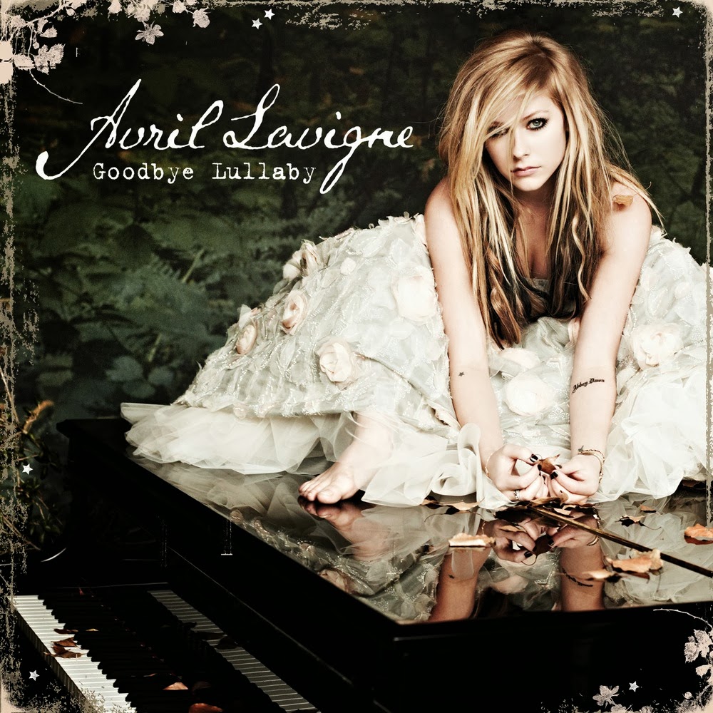
Digipak Analysis: Avril Lavigne - Goodbye Lullaby

Front:

Codes:

Text:
Main Text: Very much like 'Made Up Stories' the only text on the front cover of 'Goodbye Lullaby' the only text is Avril Lavigne with the name of the album.
Font: The font and style used on this front cover is an indication of the style of music that this album is. Normally, Avril would be associated with music that could be classed under pop-rock but this album is very much just pop, which is shown by this more sophisticated font in the style of handwriting. Surprisingly, the title of the album is written in a fairly small font, and is not very eye-catching at all. This is the exact opposite to the albums of McFly and Go:Audio. One can only assume that because
Avril is so well known, the designers are confident that she and the album will be recognised by the picture instead of by the name.

Layout:
Main Layout: Along with the size of the text, the positioning is also rather unusual. By being placed in the top right hand corner it does not take up the main focus point of the centre. Instead, the picture of Avril takes up this prime position as well as the remainder of the cover. However, the placing of Avril's head right next to the two titles does attract the buyers attention to the information needed.
Additional Features: The use of flowers as type of border once again adds to the sophistication of this CD, which very much sets it apart from the style of her previous digipaks.

Colour:
The colours used on this front cover are carried on right the way through the digipak. The majority of the background is black, making Avril and her blonde hair and white dress stand out and attract the buyers attention. Amongst this, there are also a few hints of green, including the album title, which stand out from the dark background, acting as an indicator for the buyer that this is key information. The green also makes the digipak more appealing and exciting to look at, opposed to just a simple black and white front.

Conventions:

Images:
Main Image: An image of Avril takes up the whole cover. Whilst the front cover of Go:Audio's album indicates what their songs might be about, by having Avril sitting on a grand piano (main prop), her album cover subtly suggests the style of music that the album might include. Laura Mulvery might also say that this picture follows her Male Gaze Theory as it is a full body picture, which is likely to be appealing to a male audience.
Additional Image: The only other image on the front is the age certificate suggesting that this digipak will not be suitable for children under the age of 12.

Costume: Her costume is also telling of the style as she is wearing a rather sophisticated dress, opposed to the ripped trousers that she has previously worn for her other album covers. That being said, she still has her heavy eye make-up on making her recognisable to her target audience and existing fans.


Back:

Codes:

Text:
Main Text: As expected the back of this CD contains the track list and Bonus DVD contents as well as the copyright details. Anymore information than this would be wasted on a buyer as it simply would not interest them. Any additional information should be found in the lyric booklet inside the digipak.

Layout:
Main Layout: Following the conventions of a standard digipak back cover, the track listings are placed on the right had side. All of the other information is placed at the bottom in a smaller font which suggests that it is less important, but also so the designers can fit everything on that they need.

Colour:
The colour scheme on the back is carried on from the front cover so maintain the house throughout. This means that if a buyer once only saw the front cover and then another time saw the back cover, they would recognise that it is the same digipak. It is also not very appealing to have one design on the front and a completely different one on the back as it can confuse the style of the CD and artist.

Conventions:

Images:
Main Image: Images on the back include, a similar picture of Avril to the one on the front which takes up the majority of the back cover along with the track listings.
Additional Images: Aside from this there is the logos for the record companies, a barcode and an age certificate. This age certificate is important if there is any offensive music on the CD,
and a record company is therefore obliged to warn a buyer about this.

Inside:

Codes:

Text:
The only text used on the inside of this digipak is the name of the artist and album on the CD along with the
record companies logo.

Layout:
Main Layout: The layout is very simple inside. Taking on the conventional style with the CD holder on the left hand side and space for the back of the removable leaflet on the left. This keeps in line with conventions and is an aspect that I will aim to replicate in my own digipak.

Colour:
As expected, the colour scheme used on the inside of the digipak mirrors that of the rest of the pack. Along with the similar images this ensures a continuity and house style throughout. The use of greens, whites and blacks also indicates the style of music as their duller qualities suggest a more sophisticated pop sound opposed to bright reds, oranges and pinks which would suggest a more upbeat pop style.

Conventions:

Images:
Main Image: Images from the same photoshoot that are used on the front and back are also used inside. This helps maintain a house style throughout.
Stock Character: Once again Avril is the centre of the picture so that the buyer cannot be mistaken as to who the album is for.

Representation:

All codes and conventions mentioned have been used to create a representation of the album 'Goodbye Lullaby'. This rather significant change in style from her previous digipaks suggests a new sophistication to her music that has developed as she got older. Therefore, one could also say that this digipak represents her desired audience as her original fans have also matured and grown up with her. Overall, these features establish the genre of the album so that the target audience can build an idea of what to expect when buying the digipak.

Digipak Analysis: Go Audio - Made Up Stories.

Front:

Codes:

Text:
Main Text: Much like the front cover of Radio:ACTIVE the only text is the name of the band 'Go:Audio' and the title of the album 'Made Up Stories'. This makes sure that the buyer is not distracted by anything else and the key information is retained well.


Layout:
Main Layout: Due to the cover being relatively simple, there is not much to be said about the layout. Only that the two names have been placed in the centre in the top half of the page. The positioning of 'Made Up Stories' makes it the main focus point of the cover as it instantly attracts the buyer's attention. Style: The layout resembles greatly one of a book cover, therefore it keeps in line with the idea of it being a book.

Colour:
The colours used here are striking, like a cartoon which links into the idea that it is a comic or a book. By making the title of the album red against a dark background the buyers attention is instantly drawn to it. By making the sun/moon green, the album appears more abstract, which is enhanced by the presence of a dinosaur in a spacesuit. The red book in the bottom right hand corner also stands out by being red, which draws the buyers attention to the album title which is replicated on the book cover.

Conventions:

Images:
Main Image: The front cover is very interesting and corresponds well with the title of the album. In the image we see and dinosaur in a space suit, who looks to be terrorising a young lady.
Setting: The setting is a green planet with something that resembles a green sun or moon. Obviously, this is supposed to be a 'made up story'  which suggests that the style of this album is going to be very fun and quirky.
Logos: In the top corner, there is a logo which says 'A Go:Audio comic'. The style of this digipak is a little book, as if it were to contain these made up stories. So this logo in the corner enhances this idea as something like this would usually be found on the cover or spine of an actual book. As one would expect, the Go:Audio logo features on the album cover and would be recognisable to any existing Go:Audio fans.

Back:

Codes:

Text:
The text on the back is very minimalistic. There is a simple list of all the songs on the CD which is actually very effective. It is straight to the point and contains all the information that a buyer would actually want to read.

Layout:
Again, the layout is extremely simple. Both the text and the barcode are placed on the left hand side in a structured form which makes it very easy to navigate and read all the titles.

Colour:
By making the background a mixture of blue and black, the red writing stands out really well, once again making it easy for the buyer to read the information. The colour scheme of the background is uniform as it carries on from the colour of the sky on the front of the case.

Conventions:

Images:
The sole image is a barcode which is a pretty standard thing to see on the back of a digipak.

Inside:

Codes:

Text:
As you open the first page of this CD case, there is once again the name and title of the band and album but also a dedication. This is another way in which it follows the format of a book. On the corresponding side at the back of the 'book' is the copyright details. This contrasts with many other digipaks which place theirs on the back conventionally.

Layout:
There is no order to the layout inside as the pictures are arranged in a collage style. This makes it appear less formal and very much like a personal book of memories. Instead of using the standard plastic holder for the CD Go:Audio use a simple sleeve at the back.

Colour:
The majority of the photos are either dark or in black and white. The dark ones are mostly from their live concerts whilst the black and white ones were done professionally for this digipak despite the want for it to be quirky like a comic. The very front page and page with the sleeve on are simply black and white with pencil sketches covering them, which looks like the beginnings of a comic.

Conventions:

Images:
Main Images: The images inside make-up pretty much the whole thing. Before we get to the CD there are four double sided pages of photos of the band. This gives the buyer an idea of their personalities which can be important for some people as they like to know about the band and feel a sense of connection.
Target Audience: There are also pictures of fans on these pages which once again shows how they value their connections with their fans. The majority of the pages have 'Go:Audio' written in various forms e.g. in sand, in fridge magnets and on a drum kit. This is a constant reminder for the buyer who this band is.


Digipak Analysis: McFly - Radio:ACTIVE

Front:

Codes:

Text:
Main Text: As you would expect with a digipak the text is limited on the front. Obviously, the name of the band and the album are featured.
Additional Text: If you look closely on each, individual picture in the corner there is a small bit of text saying "Radio:ACTIVE 20/09/08 20:15" although the time changes on each one. By doing this the audience subconsciously if not consciously sees Radio:ACTIVE about 10 times on the front cover alone, aiding the retention of the name.


Layout:
General Layout: The layout of this front cover is very well thought out. Each member has their own box and in turn are shown to be looking at each other. This makes the cover appear more interesting opposed to just having them staring out at the buyer. Information Layout: Of course, the McFly logo of their name, is placed right in the centre of the cover making it the main focus point of the front cover.

Colour:
The colour scheme used throughout the entire digipak is related to the title of the album - Radio:ACTIVE. When one thinks of something being radioactive, one normally thinks of a vivid green item, and this is relayed through the colour scheme of the CD and DVD case. It is important to maintain a constant colour scheme across all products associated with this album so that there is a recognisable link.

Conventions:

Images:
Main Images: As for the images each member of McFly has there own separate picture on a TV screen as if they are being surveilled. Each member acts as a Stock Character as they are recognisable by the bands current fans and they are in effect the band's representatives.
Logos: In between them the logo for this album of the old style microphone with a mouth is featured in the remaining squares. McFly have continued to use this logo, on merchandise since the release of this album. Therefore, this makes this album instantly recognisable to be McFly if you failed to notice all the other images and clues which tell you who it is as well. Surprisingly there is no logo for the record label who produced this album, this is quite unusual but I expect it will be present elsewhere.

Costume:
The costume of the band is a little difficult to see, and is not a very important factor in this digipak. From what we can see it appears that they are wearing simple everyday clothing. Two are wearing shirts whilst the others are simply wearing t-shirts. The use of black and white, stripes and squares shows there diversity and can link them to their target audience as they are likely to be something they would wear. 

Back:

Codes:

Text:
Main Text: Following the normal conventions of a digipak, the back lists the songs that appear on the CD and also the items that the buyer can find on the bonus DVD.
Additional Text: Underneath that, details of their management and production team are listed along with the copyright terms. All of this text is rather small as it is not intended for the buyer to read as soon as they lay eyes on it. The important pieces are the song tracks, which will determine whether or not the buyer is interested in this digipak.


Layout:
Main Layout: As you can imagine the layout is very straight forward as the information about the contents of the CD and DVD take up virtually the whole image. Whilst this makes it very busy, it does not deter a buyer because it is information that would interest them greatly. This digipak does not follow normal conventions of a back cover as the tracks would normally be placed on the left hand side. But this quirky style very much fits in with the style of the rest of the case as the text is supposedly placed inside a TV screen, keeping in line with the house style established on the front cover.

Colour:
Much like the front cover the only colours featured are green and black, continuing with the radioactive style.


Conventions:

Images:
Main Image: There is a distinct lack if images on the back. Only decorative bolts are used to make the back look more interesting. However, the entirety of the back is likened to a TV screen, just like the front cover is. Logos: In addition, at the bottom there is the record labels logo, although unlike the magazine adverts this is placed in the centre opposed to one of the corners.

Inside:

Codes:

Text:
Due to all the information being on the back and in the additional lyric booklet and on the back, there is no writing on the inside. Only the name of the band and album on the CD and DVD.

Layout:
Main Layout: On the left hand side there is a pocket for the lyric booklet, then the space for the CD followed by the space for the DVD. This follows the conventional style of a three piece digipak as you would expect the main attraction of the bundle (the CD) to be in the middle, with the DVD acting as the extra bonus on the end.

Colour:
Once again, the green and black colour scheme is used. On the CD the background is green with the text and image being black. However, for the DVD the background is black whilst the text and image are green. This helps the buyer to determine easily which is which without having to read the small print.

Conventions:

Images:
Similar to the text the only images are abstract design images. But on the CD and DVD there is the screaming microphone and the McFly logo. In addition, underneath each disc the image of the microphone is repeated

Magazine Advert Analysis: Evanescence - The Open Door


Codes:

Text:
Main Text: Once again, this magazine advert uses the absolute minimum in terms of text. One element that is different is that this is an advert for an album that is yet to be released. This means that it is essential that 'Out November 2nd' stands out from the page.
Additional Text: Underneath this, slightly smaller, is the mention of her single. Obviously here, the creator of the advert has decided that this is not as important as the date of the release but it still needs to be there to attract the audience.
Font: All of the font is a serif font. Similar to the Paramore advert, this suggests that the audience and the album is more a more sophisticated style of pop.

Layout:
Image: Much like the Jessie J advert all the important text is in the lower half in the centre of the page. It is difficult to tell where the main focus point is as there is a lack of material in the middle. Certainly, the image of the girl, on the left hand side attracts the readers attention as it stands out from the rest of the seemingly dark advert.
Motif: By placing the Evanescence motif slightly to the right it is complying with the rule of thirds which should mean that the reader finds it more pleasant to look at this placed here rather than right in the centre. Another reason for placing it here, would be so it works with the image. The motif would not have such a good effect if it was placed over the main part of the image. Therefore, the sensible idea would be to place it slightly off centre.
Logos: Again much like both the other adverts, the two record label logos are in both the bottom corners, so it is likely that the reader will view them last and as it has been said that one's memory best remembers items placed first and last this could be a good decision.

Colour:
Main body: The colour scheme used is very limited. It is mainly black, white and gold used. This largely dark style reflects perhaps the type of music normally made by Evanescence, but at the same time it fits in well with the setting of the image. Much like the Jessie J advert the gold suggests luxury music.
Logo: The 'Virgin Megastores' logo stands out profoundly on this advert. By not conforming to the rather dull colour scheme, the logo although rather small catches the readers eye and is instantly recognisable as one of the Virgin brands.

Conventions:

Images:
Main Image: The image on this advert is interesting. It is difficult to tell whether it is a real photo or not but due to the slightly bizarre angles and perspective of the photo, one would assume that it is computer generated.
Character: From the others that I have analysed this is a unique element and there is a noticeable absence of an image of the main singer, although the image is of a girl indicating the gender of the artist. Another reason for using a girl would be firstly to attract the female audience as they have the potential to be able to identify with the topic of the songs. However, Male Gaze Theory would suggest that using a girl would also attract a male audience as the image of a woman would attract their attention and get them interested in what is being advertised. Long shots, as used in the advert, are a key feature of this theory so that the male audience can see the full body of the female.
Album Front Cover: In addition, it is unclear what the front cover of the album looks like, it could be that this image is used as well but the reader would not be sure.
Logo: The only real element of this advert that makes it recognisable as Evanescence, is their own 'logo' of sorts. If you look at other merchandise a similar style will be used for the bands name and title of the album. This will be effective in catching an Evanescence fan's attention. Also, when the reader sees this elsewhere they will instantly recognise it's unique design.
Image Design: Another unique element of this advert is the use of a texture design. If you look closely you can see that although it would physically be printed on a smooth page in a magazine, the image includes the look of a rough texture. This gives the advert an old fashioned feel which could be another indication to the style of the album. The only other images on this advert are the logos for the record companies. Once again, these will have been used solely to promote the companies as they attempt to attract a wider audience and potential new artists.

Setting:
The setting of the main image is somewhat surreal, as the audience would not come across this setting in everyday life. The large door that reveals the dark sky outside is another indication of the style of music that this advert is promoting.

Costume:
The dress worn by the girl in the photo is, as you would expect, very unusual. The dress is not something that would be worn everyday by the audience, but something that you would more likely find in a fantasy film. Again this is important in portraying the alternative style of pop music that this poster is advertising.

Representation:
The main representation here is purely the representation of the style of music of the album 'The Open Door'. Without a clear picture of the artist it is difficult to represent her personality. With Jessie J the audience gets a clear idea of what she stands for. However, with this advert there is no interaction between Evanescence and her audience so this cannot be established. All the codes and conventions already explored all work together to make a representation of the album style, which would come under the label of alternative pop. 

Thursday, 14 November 2013

Magazine Advert Analysis: Jessie J - Who You Are


Codes:

Text:
Main Text: Just like the Paramore advert the text used here is very minimal but is effective. 'Jessie J' and the title of the album stands out from the rest as they are written in fancier fonts that are more eye catching.
Additional Text: At the same time the text on the lower half of the advert also stands out, especially 'Who you are' and 'Price Tag' which have been put in a larger font to attract the audience's attention. 'Price Tag' was one of Jessie J's major hits so by putting that on the advert the reader is more likely to invest in the CD as they know they will ike at least one of the songs. Also, by mentioning B.o.B there is the potential to attract fans of B.o.B as well as Jessie J fans. Finally, by including a website, the reader has the opportunity to find out more about the artist and it will also lead them to other things they could buy.
Website Address: The inclusion of Jessie's website gives the audience another median that they can explore to find out any other information about the artist or album, this is essential in that not much information is used on adverts and should the audience have any questions they need somewhere to look for the answers. It is also important as the internet is a big part of many people's lives these days that Jessie J is associated with it.

Layout:
General Layout: Unlike the 'Brand New Eyes' advert the layout of this is very simple. Being split into two halves means the reader's attention is captured by the picture then they can simply follow the natural line down to read the information.
Information Layout: Also, all the important information is in the column middle of the advert which means the reader has to make minimal effort in order to take in all the information, this is vital for a magazine advert as it is unlikely the reader will be willing to spend a lot of time looking at the page.
Composition: By placing Jessie J in the centre she is the main focal point of the advert and is the basis for the column style that this advert uses. As the audience would be instantly attracted to look at Jessie's face first they then follow the same line down to all of the necessary information.

Colour:
This advert is very clever in its use of colour as there are actually only three colours used; black, white and gold. In conjunction, with Jessie's hair her lipstick, clothes, eye make-up and nails are all black. This makes her really stand out from the advert as her appearance is very distinctive and recognisable to the reader. Due to Jessie being dressed almost completely in black the white background is what makes her stand out even more. On the contrary the white writing stands out from the black background.The gold nicely stands out from the black and as gold is normally linked to the idea of money and success there is a hint that this album is very good and successful.

Conventions:

Images:
Main image: The main image used in this advert takes up round about three quarters of the page. This means that as soon as the reader turns the page their attention is instantly grabbed, as Jessie J stares out at them. Stock Character: Naturally, by using Jessie J herself, before the reader has even read the text, they instantly know who and what this advert is about. The Male Gaze theory states that women are often shown in full body, to attract a males attention. However, here a close up shot is used simply of Jessie J's face. This makes the advert more powerful as her demeaning expression and face in general really stands out from the page. Despite this, her perfect complexion and general attractiveness will play a part in attracting a male audience. When this advert was used, Jessie J was known for her jet black hairstyle so this it was important that the photographer and designer both made this a central point of the photo and the finished advert.
Logos: In the two bottom corners, similar to Paramore's magazine advert, the two logos for the record companies are used to promote themselves and other music they have produced.
Shadows: There are very minimal shadows on this advert, this makes the advert appear very stylistic and professional - something that will undoubtedly attract the audience. The only shadows used are ones on Jessie's face, enhancing her features and consequently helping her powerful expression to have an effect on the audience.

Setting:
The image of Jessie J is simply placed on a white background. By not having her in a noticeable setting the audience is once again forced to only notice the important information provided by the minimal text used.

Costume:
Jessie's black costume and gold earrings are important as they keep in the theme of the advert. The lace style of her top makes her more attractive to males and her gold earrings make her also desirable. By making her wear this outfit her clean cut style of pop music is presented well, whereas if she has been wearing a tracksuit I feel the audience would be expecting a different style of music.

Representation:
There is a clear representation of not only the style of music that this advert is promoting but also Jessie J herself. Through her expression one understands that she is serious about her music and wants to be taken seriously. The gold pattern on her lip is unusual and therefore represents the occasional unusual vocal runs in her music. The title of her album 'Who You Are' represents her as as caring person and someone who cares about each individual and their own personality. 

Magazine Advert Analysis: Paramore - Brand New Eyes


Wednesday, 13 November 2013

Music Video Analysis: Katy Perry - Firework

Initial Thoughts:

'Firework' is a very powerful music video as it focuses on the individual. Once again, like Jason Mraz's music video, it uses 'real people' to convey it's ideology, and I am interested to find out whether similar techniques are used to do this so I can then mirror them in my own video.

Conventions

Props
There are limited important props in this music video. But perhaps the most significant ones are those that are used by the magician. Through these props he shows his unique side and wins over the men who were about to mug him. Whilst this prop is not relative to the pop genre, they are extremely relevant to the narrative, as they are part of who he is.


Costume
Once again many of the costumes in this music video are relatively in significant in that they are modelled to their character and that is all. However, Katy Perry is wearing a white dress which could depict the idea of purity, concerning all of the different characters in the video. It shows how their lives are pure, honest and overall important.

Setting
As many pop videos use split narratives we can expect a range of settings to be used. The audience is mainly presented with everyday settings including a house, hospital, nightclub and a pool party. This indicates the normality of the characters and is used to highlight their problems. For example, the girl
who is conscious about her body is at a pool party, where obviously she would be expected to wear swimwear. Similarly, the boy who is tormented by his parents arguing is placed in his home, where the majority of arguments happen - out of sight from the wider world.
At the end of the video people congregate what looks to be a main square of a city. Normally during the day people would be expected to socialise here and it is a place they would all have in common. This can therefore be used to show the unity amongst everyone. Although, the ideology of the song shows everyone to be special, these scenes show the recognition of each individual as they all celebrate together their happiness and uniqueness. Every setting has clearly been chosen carefully and enhances each small narrative in the story.

Stock Characters
Very much like the settings, due to the split narrative idea the characters used are perceived to be normal people including a young person with cancer, a girl who self-conscious about her weight and a teenage boy amongst others. By using 'normal' people, the audience can relate better to the song and can appreciate the ideology more, that everyone is special and that they have the potential to take control on the 'demons' in their life and overcome their fears. This can be very important for pop videos as they want to appeal to the wider audience.

Stock Events
As mentioned before the split narrative dominates the entirety of this music video. The everyday events of birth and parties again help the audience to realise their potential the have an impact on their everyday lives. It also shows how every thing you do, no matter how futile it may seem at the time, can be important. A good example of this is when the teenage boy attempts to stop his parents fighting. It is likely he might have done this out of impulse with little hope that it would have an effect but through trying, he comes out of his shell and stands up for his Mother, which almost releases him in a sense, to do the same thing next time his parents argue.

Codes

Camera Angle
As you would expect from a pop video, there are many different camera angles throughout the four minute video. Some significant ones include the low angle at the end which portrays a sense new found power and strength from the people with the fireworks coming out of them. Again, this indicates how everyone has the potential to be powerful and special and take control of their lives.
At the same time there are several high angle or even birds eye view shots that look down on the wealth of people who have the fireworks coming out of them. This would have been done to indicate to the audience, once again, how everyone is important and unique.

Camera Range
Through the use of close-up shots the audience can see the emotion in everyone's faces which helps to engage them in each narrative. The establishing shots also use camera range to create a very effective opening sequence. The first shot is an extreme long shot and following that each shot becomes more zoomed in and focuses on smaller detail. By the end of the opening sequence the camera has focused in on Katy Perry who is standing no top of one of the many buildings in the city. This could symbolise how its the people who make the city what it is and therefore how it is the inside of a person that counts and the personality opposed to the overview and the first impressions.
When the fireworks are introduced to each person a mid shot is generally used so you can see the effect on the person, but also long shots are regularly used to show the amount of people who are confident and who are alive with this firework.

Composition
Composition is sometimes difficult to do in pop music videos as in general people are moving about within the frame a lot. Looking at Katy Perry's parts in the video, when she sings into the camera she abides by the rule of thirds, which states that an audience prefers to look at something that is slightly off centre opposed to the dead centre. It is important for pop music videos that during parts of the video when the singers is singing to the camera that this rule is taken into account.

Editing
Due to the upbeat tempo of this song the editing is fairly fast paced and becomes faster as the song progresses. This helps to show the energy in the song and also keeps the audience interested and on their toes as they try to keep up with each shot. That being said the editing is rather unobtrusive which is vital as with the in depth narrative being the main bulk of the video it doesn't want to detract from the storylines.

POV
The use of POV is very effective in 'Firework'. Each time it is used the audience can see the challenge that each character faces. This is important, in that the audience does not therefore have to make up their own mind what might be their specific hurdle to jump.

Lighting
Like all the other codes and conventions lighting pays a big part in this video. The majority of the scenes are fairly dark, these are then lighted up by the fireworks. This shows how everyone plays a role in making the world what it is and how important the individual is in some situations.


Mis-en-scene
The use of fireworks is extremely significant in this music video. Without them the whole ideology would not be presented as well. Most people associate fireworks with celebration and happiness. Therefore, as they symbolise a new found confidence in each person, a starting point for them to grow as a person. Perhaps one of the most significant points this is used is the scene where the baby is born. The firework there represents the new life, the potential and the uniqueness of this baby who is only just entering this world and has the ability to do anything.

Ideology
The ideology in the song is perfectly summed  up by the line 'you're original, cannot be replaced'. The aim is to make people realised that they are special, there is no need to be ashamed of who they are and that they have the power inside of them to do whatever they like.