

Showing posts with label McFly. Show all posts
Showing posts with label McFly. Show all posts
Thursday, 23 January 2014


Sunday, 19 January 2014
Monday, 13 January 2014
Music Video 1st Draft - Commentary
As before I started filming I made precise storyboards which labelled which shots I would need, in what order and for how long, when I came to editing it all together the initial part of placing all the shots in the correct order was relatively simple once I had found the best take for each shot. Whilst I was filming with my actors and actresses I did each shot three times to make sure that I had at least one usable take every time. Even if I was happy with the first or second take I still did the others in case there was a mistake in it which I had not noticed at the time.
In my 'Project I'll Be Ok' post, I showed how I used Facebook to collect pictures of my target audience. To incorporate these into my music video, I opened up a new project and placed each picture on its own track. Whilst it would have been possible to put them all on the same track, this made it a lot easier when making them fly in just half a second or so after the previous one and it also helped me to get the fades right. If they had all been on the same track, I would not have been able to so easily manipulate the fades. After I got every picture where I wanted it in my specific timeframe, I exported the whole thing as its own movie. This then enabled me to put it into my music video project and the whole section being on one track.
To make my music video look realistic and appropriate for my genre I used mainly straight cuts and fades between the shots. Spinning clips or 'blind fx' would simply not have been appropriate for the style of the song, and would definitely not appeal to my target audience. The fades help the video flow with the slow tempo, whilst the straight cuts indicate slight tempo changes and urgency within the song.
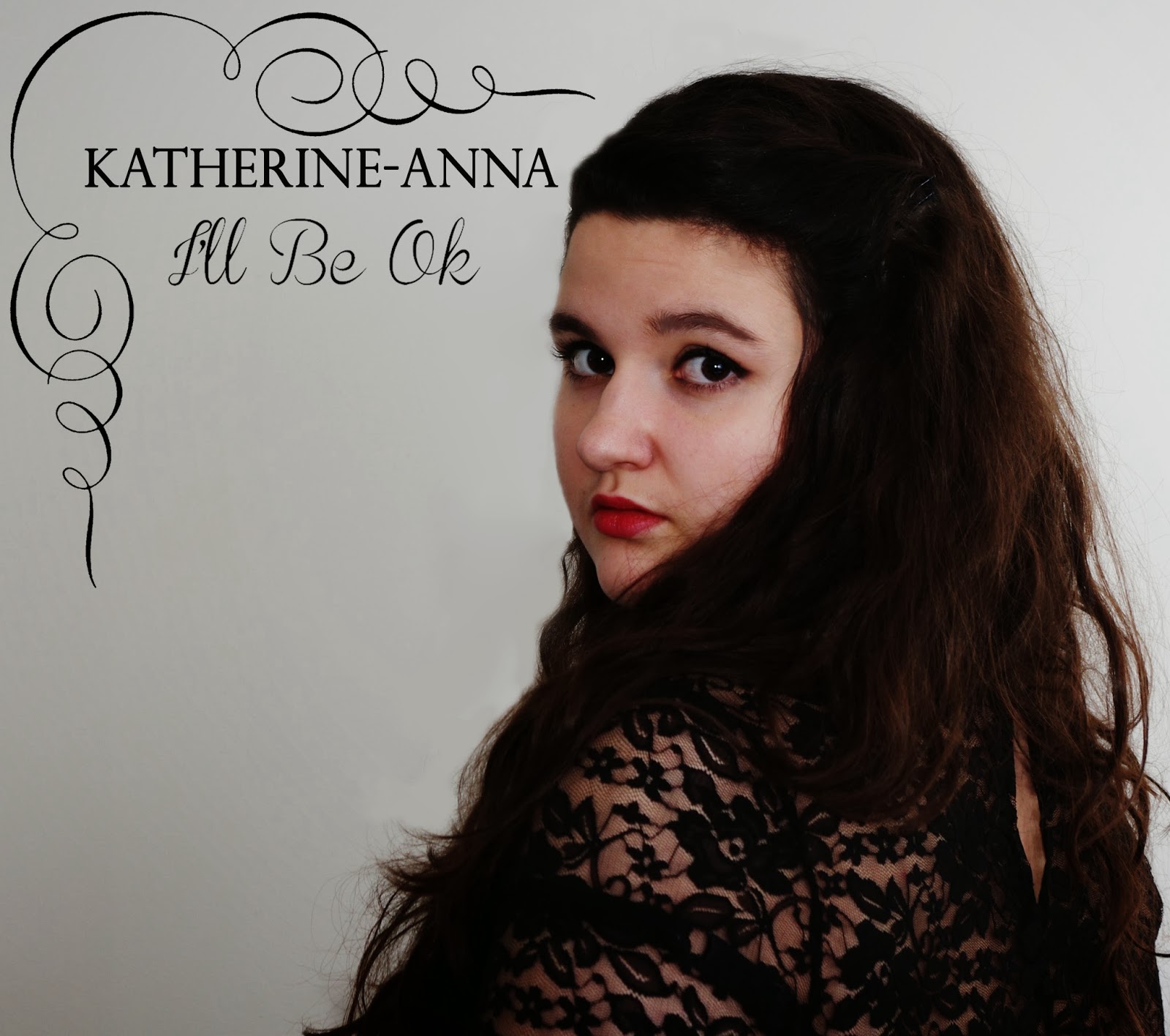
As my music video, is based around a split narrative I decided to use some filters that change the colour of the clips slightly to indicate the difference between the narrative and the singer storyline. At present, my singer, Katherine-Anna, has not filter on as her colours are vibrant and natural already, indicating happiness and normality. On the other hand I have used a 25% Black and White filter for my narrative storylines. By making these scenes darker, I hope to evoke sympathy and sadness in my target audience. I plan to hold focus groups and conduct more surveys to see whether my target market of young people, think that this filter should be more prominent and if they think a 50% or even 75% Black and White filter would be better.
At the beginning of my music video, we see a scene about the nuclear family. To show this ideal but also to suggest a flashback I used 'Light Rays - Moderate Bound Spotlight' I find that this FX is very effective as the family appears to be shining through the light rays.
For some shots, I have used slow motion. On some occasions it is not noticeable as the aim was the simply to slow the actions down slightly. In other shots it is more noticeable, especially in between scenes. I did this because I think it fits in nicely with the tempo of the song and gives the audience an extra second or so to relate to the character. When the homeless girl pulls the glove off the branch, for example, with the use of slow motion, the audience can see her struggle more and realise how sad her life is that she has to take a glove she has just found to keep warm. When this clip was not slowed down, it also was not very appropriate for the song as the tree swung back rather quickly, ruining the emotional effect I wanted it to have on my audience.
In my 'Project I'll Be Ok' post, I showed how I used Facebook to collect pictures of my target audience. To incorporate these into my music video, I opened up a new project and placed each picture on its own track. Whilst it would have been possible to put them all on the same track, this made it a lot easier when making them fly in just half a second or so after the previous one and it also helped me to get the fades right. If they had all been on the same track, I would not have been able to so easily manipulate the fades. After I got every picture where I wanted it in my specific timeframe, I exported the whole thing as its own movie. This then enabled me to put it into my music video project and the whole section being on one track.
To make my music video look realistic and appropriate for my genre I used mainly straight cuts and fades between the shots. Spinning clips or 'blind fx' would simply not have been appropriate for the style of the song, and would definitely not appeal to my target audience. The fades help the video flow with the slow tempo, whilst the straight cuts indicate slight tempo changes and urgency within the song.
As my music video, is based around a split narrative I decided to use some filters that change the colour of the clips slightly to indicate the difference between the narrative and the singer storyline. At present, my singer, Katherine-Anna, has not filter on as her colours are vibrant and natural already, indicating happiness and normality. On the other hand I have used a 25% Black and White filter for my narrative storylines. By making these scenes darker, I hope to evoke sympathy and sadness in my target audience. I plan to hold focus groups and conduct more surveys to see whether my target market of young people, think that this filter should be more prominent and if they think a 50% or even 75% Black and White filter would be better.
At the beginning of my music video, we see a scene about the nuclear family. To show this ideal but also to suggest a flashback I used 'Light Rays - Moderate Bound Spotlight' I find that this FX is very effective as the family appears to be shining through the light rays.
For some shots, I have used slow motion. On some occasions it is not noticeable as the aim was the simply to slow the actions down slightly. In other shots it is more noticeable, especially in between scenes. I did this because I think it fits in nicely with the tempo of the song and gives the audience an extra second or so to relate to the character. When the homeless girl pulls the glove off the branch, for example, with the use of slow motion, the audience can see her struggle more and realise how sad her life is that she has to take a glove she has just found to keep warm. When this clip was not slowed down, it also was not very appropriate for the song as the tree swung back rather quickly, ruining the emotional effect I wanted it to have on my audience.
Sunday, 12 January 2014
1st Draft Music Video
http://www.youtube.com/watch?v=0K_zs_0ovxo
This is the link to my 1st Draft of my music video. Unfortunately due to issues when rendering the video I had to change the track I used to the version without the lyrics. But, I will sort this issue out very soon and upload one up with the lyrics.
This is the link to my 1st Draft of my music video. Unfortunately due to issues when rendering the video I had to change the track I used to the version without the lyrics. But, I will sort this issue out very soon and upload one up with the lyrics.
Friday, 3 January 2014

Thursday, 2 January 2014


Friday, 15 November 2013
Digipak Analysis: McFly - Radio:ACTIVE
Front:
Codes:
Text:Main Text: As you would expect with a digipak the text is limited on the front. Obviously, the name of the band and the album are featured.
 Additional Text: If you look closely on each, individual picture in the corner there is a small bit of text saying "Radio:ACTIVE 20/09/08 20:15" although the time changes on each one. By doing this the audience subconsciously if not consciously sees Radio:ACTIVE about 10 times on the front cover alone, aiding the retention of the name.
 Layout:
General Layout: The layout of this front cover is very well thought out. Each member has their own box and in turn are shown to be looking at each other. This makes the cover appear more interesting opposed to just having them staring out at the buyer. Information Layout: Of course, the McFly logo of their name, is placed right in the centre of the cover making it the main focus point of the front cover.
Colour:
The colour scheme used throughout the entire digipak is related to the title of the album - Radio:ACTIVE. When one thinks of something being radioactive, one normally thinks of a vivid green item, and this is relayed through the colour scheme of the CD and DVD case. It is important to maintain a constant colour scheme across all products associated with this album so that there is a recognisable link.
Conventions:
Images:
Main Images: As for the images each member of McFly has there own separate picture on a TV screen as if they are being surveilled. Each member acts as a Stock Character as they are recognisable by the bands current fans and they are in effect the band's representatives.
Logos: In between them the logo for this album of the old style microphone with a mouth is featured in the remaining squares. McFly have continued to use this logo, on merchandise since the release of this album. Therefore, this makes this album instantly recognisable to be McFly if you failed to notice all the other images and clues which tell you who it is as well. Surprisingly there is no logo for the record label who produced this album, this is quite unusual but I expect it will be present elsewhere.
Costume:
The costume of the band is a little difficult to see, and is not a very important factor in this digipak. From what we can see it appears that they are wearing simple everyday clothing. Two are wearing shirts whilst the others are simply wearing t-shirts. The use of black and white, stripes and squares shows there diversity and can link them to their target audience as they are likely to be something they would wear.
Main Images: As for the images each member of McFly has there own separate picture on a TV screen as if they are being surveilled. Each member acts as a Stock Character as they are recognisable by the bands current fans and they are in effect the band's representatives.
Logos: In between them the logo for this album of the old style microphone with a mouth is featured in the remaining squares. McFly have continued to use this logo, on merchandise since the release of this album. Therefore, this makes this album instantly recognisable to be McFly if you failed to notice all the other images and clues which tell you who it is as well. Surprisingly there is no logo for the record label who produced this album, this is quite unusual but I expect it will be present elsewhere.
Costume:
The costume of the band is a little difficult to see, and is not a very important factor in this digipak. From what we can see it appears that they are wearing simple everyday clothing. Two are wearing shirts whilst the others are simply wearing t-shirts. The use of black and white, stripes and squares shows there diversity and can link them to their target audience as they are likely to be something they would wear.
Back:
Codes:
Text:Main Text: Following the normal conventions of a digipak, the back lists the songs that appear on the CD and also the items that the buyer can find on the bonus DVD.
Additional Text: Underneath that, details of their management and production team are listed along with the copyright terms. All of this text is rather small as it is not intended for the buyer to read as soon as they lay eyes on it. The important pieces are the song tracks, which will determine whether or not the buyer is interested in this digipak.

Layout:
Main Layout: As you can imagine the layout is very straight forward as the information about the contents of the CD and DVD take up virtually the whole image. Whilst this makes it very busy, it does not deter a buyer because it is information that would interest them greatly. This digipak does not follow normal conventions of a back cover as the tracks would normally be placed on the left hand side. But this quirky style very much fits in with the style of the rest of the case as the text is supposedly placed inside a TV screen, keeping in line with the house style established on the front cover.
Colour:
Much like the front cover the only colours featured are green and black, continuing with the radioactive style.
Conventions:
Images:
Main Image: There is a distinct lack if images on the back. Only decorative bolts are used to make the back look more interesting. However, the entirety of the back is likened to a TV screen, just like the front cover is. Logos: In addition, at the bottom there is the record labels logo, although unlike the magazine adverts this is placed in the centre opposed to one of the corners.
Inside:
 Codes:
Text:Due to all the information being on the back and in the additional lyric booklet and on the back, there is no writing on the inside. Only the name of the band and album on the CD and DVD.
Layout:
Main Layout: On the left hand side there is a pocket for the lyric booklet, then the space for the CD followed by the space for the DVD. This follows the conventional style of a three piece digipak as you would expect the main attraction of the bundle (the CD) to be in the middle, with the DVD acting as the extra bonus on the end.
Colour:
Once again, the green and black colour scheme is used. On the CD the background is green with the text and image being black. However, for the DVD the background is black whilst the text and image are green. This helps the buyer to determine easily which is which without having to read the small print.
Conventions:
Images:
Similar to the text the only images are abstract design images. But on the CD and DVD there is the screaming microphone and the McFly logo. In addition, underneath each disc the image of the microphone is repeated
Similar to the text the only images are abstract design images. But on the CD and DVD there is the screaming microphone and the McFly logo. In addition, underneath each disc the image of the microphone is repeated
Sunday, 3 November 2013
Permission Update
 |
| Tom Fletcher. |
Subscribe to:
Posts (Atom)